Typefaces for Dyslexia
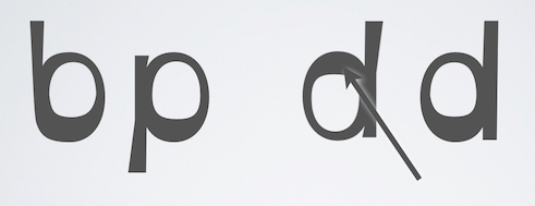
A heavier bottom is used to show which way is supposed to be down.
I’ve been writing this post in fits, so it may be a bit disjointed. I started it on my flight home from CSUN, and continued to work on it on subsequent flights. Apologies if it’s a bit chaotic.
TL;DR: Typefaces designed to help dyslexics have no effect.
I’ll list information about the two typefaces that I am aware of (which are designed explicitly for readers with dyslexia), as well as notes from the talk at CSUN and a couple other examples.
Typefaces
I am aware of two typefaces that are designed with dyslexic readers in mind.
OpenDyslexic
Open Dyslexic is an open source typeface for readers with dyslexia. The rationale behind the design:
OpenDyslexic is created to help with some of the symptoms of dyslexia. Letters have heavy weighted bottoms to indicate direction. You are able to quickly figure out which part of the letter is down which aids in recognizing the correct letter, and sometimes helps to keep your brain from rotating them around. Consistently weighted bottoms can also help reinforce the line of text. The unique shapes of each letter can help prevent confusion through flipping and swapping.
Dyslexie
Dyslexie is a paid typeface (free for home use). The site references research that supports the following claim:
Representative research among many dyslectics has shown that the font Dyslexie actually helps them with reading texts faster and with fewer errors.
- 2010 Universiteit of Twente
- 2012 Survey research on elemetary schools and home users
- 2013 Universiteit of Amsterdam
- 2013 Universiteit of Twente
I would like to note that copying that text directly from the browser wasn’t easy. The use of Cufon to embed the typeface drops each word into its own element that itself hides and replaces the raw text in a canvas element. I’m sure you can imagine how much that offends me.
The following video explains the idea behind the typeface:
Study: Can a font improve reading?
The latest study to suggest that typefaces designed to aid reading for dyslexics had little to no effect was presented at CSUN this past week. As I noted on Twitter, I already had an idea what the results would be, and I came away feeling validated.
The study hasn’t been pubished yet and I saw its first general presentation. The study was conducted at Mount Allison University, a 2,500 student college with 215 full-time students with disabilities. 50% of those students are classified as having a learning disability.
The questions asked by the study:
- Do the style of the letters on a page mean that you read faster and make fewer errors?
- Do persons with LD [learning disabilities] using this font read faster and make fewer errors?
The typefaces (Open Dyslexic and Dyslexie) make claims about their benefits, aggregated in the presentation as:
- Students with surface dyslexia experience letters flipping and moving around; Letters needed to be bottom heavy to prevent them from moving around
- New font would increase reading speed
- Will also increase accuracy (fewer errors)
- Will decrease reading stress
- Widely promoted to on-line uses and in word processing (Instapaper, iPad, an app)
- Strong anecdotal feedback
The presenter outlined some literature references, the procedure the team followed to perform the study, the nature of the participants (and control group), and the overall results.
The first bullet in the summary wraps it up nicely:
- The font does NOT improve reading speed or accuracy for students with LD.
An interesting note from the study was that half of each group (50% of control, 57% of LD group) said they would consider using the font and were then shown how to access it (download and install it, which I assume was Open Dyslexic). In a follow-up, none of those participants were using the font.
Another interesting point was that 40% of the control group and 48% of the LD group thought they performed better when using Open Dyslexic, though that was not the case.
As anyone who’s done user testing knows, it’s not uncommon for users to report one thing while doing or thinking another, so I consider this to be anecdotal reinforcement that the typeface had no benefit for users.
Study: Good Fonts for Dyslexia: An Experimental Study
In late 2013 I found a write-up on a Spanish study that reviewed which fonts were easiest for readers with dyslexia. The post summarizes the study:
Based on the evaluation of 48 dyslexic subjects ages 11-50, reading 12 texts with 12 different fonts, they determined that reading performance was best with sans serif, monospaced, and roman fonts used in the study. They also found that reading was significantly impaired when italic fonts were used.
[…]
Use of the OpenDyslexic font did not enhance text readability or reading speed. The study participants strongly preferred Verdana or Helvetica over the OpenDyslexic alternative.
You can find the full text of the study in a PDF file on the site for the Natural Language Processing group of the Department of Information and Communication Technologies at Pompeu Fabra University.
General Tips
For those of us who build applications and sites with content of any length (whether instructions for shopping carts or rant-laden long-form articles), I have found a few techniques are generally agreed upon by the community (feedback is welcome!):
- Avoid justified text.
- Use generous line spacing / leading.
- Use generous letter spacing.
- Avoid italics.
- Generally use sans serif faces.
- Use larger text.
- Use good contrast.
- Use clear, concise writing.
This generally follows rules for good typography.
You may have heard that Comic Sans is easier for readers with dyslexia to understand, but so far that evidence appears to be anecdotal. Certainly not enough to warrant punishing all your other users.
If you read an article that suggests users with dyslexia see letters flip or rotate, then be wary. Not only was this assertion challenged by participants in the study reported at CSUN, but generally the participant reaction was anger. The flipping/rotating may be a myth perpetuated by those without dyslexia in an effort to make sense of its effects.
Update: March 26, 2015
In a post from 2011 (Dyslexia, Fonts & Open Source), Mike Gifford outlines some of the issues related to supporting readers with dyslexia, including typefaces.
Update: April 17, 2015
Neil Milliken notes that, as someone with dyslexia, he finds the custom dyslexic typefaces unhelpful and unattractive.
Update: June 5, 2015
Chuck Bigelow, creator of the Lucida Family, wrote the following back in November:
In preparing a literature review on dyslexia and typography for a major font vendor, I surveyed more than fifty scientific papers and books about dyslexia, paying special attention to those with typographic relevance. In the scientific literature, I found no evidence that special dyslexia fonts confer statistically significant improvements in reading speed compared to standard, run-of-the-mill fonts.
Some readers disagree with his assertions in comments on a Fast Company post covering his original post.
Update: July 10, 2015
There are users who get benefits from the typefaces. As expected, different people will have different results. Seren D (who also tells us of problems in icon fonts) explains:
@aardrian I find it really helpful. I find everything flows nicers and I can tell what each letter is and don't loose track of where I am
Update: December 6, 2016
Today A List Apart posted a new article, Accessibility Whack-A-Mole, that discusses a process of tweaking an existing typeface and testing it with users. It includes many tips not just for letterform adjustments, but also for layout and flow.
Update: February 28, 2017
There is a post circulating with the unfortunate title Hating Comic Sans Is Ableist. The thrust of the article is that the author’s sister, who has dyslexia, discovered her reading comprehension improved greatly when she used Comic Sans. From there the author accuses everyone who dislikes Comic Sans of lacking empathy and being ableist.
Comic Sans is ugly (to me, and quite a lot of people), as are all the other typefaces designed specifically for dyslexia. That dislike is not ableist. Making fun of someone who uses it for reading comprehension would be ableist. Embedding images in an article on a platform that does not support alternative text without providing a plain text description is ableist. Just for context, that is.
Update: March 5, 2017
At this year’s CSUN conference Gareth Ford Williams presented What Makes One Font More Accessible than Another? (that links just to the abstract, no slides are online yet). To distill the gist of his talk, he confirmed that no single typeface works for all users, though there are some common traits that help many. Traits such as letter shape, bowl size, similarities between mirrored letters, and so on. He also confirmed that pre-existing familiarity with a typeface matters. Finally, good typographic practices are a huge factor.
Update: September 5, 2017
In the post Fonts don’t matter, not much effort is given to arguing why fonts don’t matter. Instead the post addresses what you can do in your layout that is more important for readability than choosing a typeface. You could basically skip the General Tips section above and read that post instead.
Update: October 7, 2017
There is another typeface that has been around for a bit that I had no idea existed. I can only hope it is never being forced on users in lieu of good typography.
Dyslexic friendly font github.com/Orange-OpenSou… #opensource #accessibility #parisweb
Update: October 12, 2017
Accessible type selection is more important than ever. Here's how to master it. creativebloq.com/…accessible-web-typography
This over-complicates, pitches: twitter.com/netmag/…
*sigh* Do not use an illegible typeface, then good typesetting is more important.
Update: August 14, 2020
Gareth Ford Williams has written a great overview about how to choose typefaces that I highly recommend you read before you even consider a dyslexia-specific typeface: A Guide to Understanding What Makes a Typeface Accessible, and How to Make Informed Decisions. (the period is in the title, so don’t at-me)
He includes links to academic papers, typography resources, books, literacy reports, and so on. Those who know me well also know that I rail against anything about accessibility that is posted to Medium, but the information is solid and he has taken care to use good alt text.
Update: August 19, 2020
Over at The Cut is a brief article with an unfortunate title: The Reason Comic Sans Is a Public Good.
From the assertion in the title it spends half the article (two paragraphs) repeating a 2017 post claiming disliking Comic Sans is ableist (see my February 2017 update above on why that is absurd). As supporting evidence in the final paragraph we get:
To wit, Comic Sans is recommended by the British Dyslexia Association and the Dyslexia Association of Ireland. An American Institute of Graphic Arts post from last summer said that it might be the best font for dyslexics […]
Except that entire paragraph is bunk.
- The linked British Dyslexia Association page does not recommend it. The page mentions studies, acknowledges none specifically looked at typefaces, and even mentioned a survey of its users (few responded).
- The Dyslexia Association of Ireland site is down for maintenance (was it down when the article was written?), but the most recent version in the Wayback lists the fonts Arial, Comic Sans, Verdana, and Sassoon as options, while providing 30 more practical tips around layout, structure, and content.
- The 2016 AIGA post (which is structured as an interview with an unnamed interviewee) doesn’t even mention Comic Sans until the last paragraph as a throwaway reference (with no link) to a passing anecdotal mention at Dyslexic.com.
And that is the entirety of the evidence supporting Comic Sans. Go read Gareth’s post instead: A Guide to Understanding What Makes a Typeface Accessible, and How to Make Informed Decisions.
Update: January 22, 2021
Another round-up of research confirms Comic Sans is not a boon:
So there is agreement, of a sort, between the typographers and the dyslexia researchers: spacing, not letter shape, is key. However, all the researchers in this area stress more research is needed.
[…]
The big question of this article, then, has a clear answer: Comic Sans use should not be justified by claims of increased readability or benefits to dyslexic students or indeed for handwriting, but if you just like it, and your pupils like it, there is no good reason you should not use it. Or not use most other fonts for that matter. Font choice, it seems, is the least of your worries.
As usual, a single technology (a typeface) is not a quick fix for such a broad need. People need to do the work (of typesetting in this case) to really help other people.
Update: December 15, 2021
A well-intentioned article at Smashing Magazine has put forth some suggestions for supporting readers with dyslexia: Adding A Dyslexia-Friendly Mode To A Website.
It makes some suggestions that seem to only be backed up by anecdata, small sample sizes, or assumptions. It uses WCAG to justify some of its arguments. It also suggests a “dyslexia-friendly mode”. Finally, it echoes a preference for Comic Sans without backing it up in any way. In short, it may end up perpetuating myths instead of getting people to think critically about supporting users.
Gareth Ford Williams left an extensive 13 point comment (Smashing’s comment system combined 4 of them) addressing many of the assertions raised in the post. Sadly, because Smashing’s comments are both collapsed by default and have no unique IDs, it is impossible to link directly to it by anchor or text fragment (yes, I pinged Smashing about this). So go to the comment section, activate the “Load all…” button, and scroll down to Gareth’s comment dated December 14, 2021 (there is another earlier comment by a different Gareth). Smashing Magazine recently updated its commenting system to allow direct links to comments.
Gareth also wrote a post on LinkedIn, Dyslexic Myths Presented as Truths. Sadly, since it is LinkedIn, if you want to see all the comments on Gareth’s post you need to have an account and be logged in. And if you find LinkedIn’s WCAG-failing non-underlined links impossible to identify, you can run my underline bookmarklet.
Update: May 2, 2023
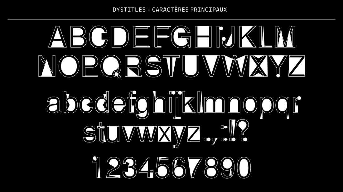 Ads of the World profiled a new typeface designed for use in video captions to benefit dyslexic viewers:
CANAL+, working closely with ad agency BETC Paris and NGO Puissance Dys (created in 1992 by Beatrice Sauvegeot and Dr. Jean Metellus with the ambition of helping dyslexic people) has come up with a solution for all these people – 8 to 12% of the world’s population – and is introducing DYSTITLES: subtitles adapted for reading for dyslexic and non-dyslexic people.
Beatrice Sauveagot, speech therapist and neuropsychologist, President of Puissance Dys, has spent the last ten years developing a font adapted for dyslexic people. Based on this initial research, BETC and Puissance Dys created a new font that can be read by everyone. Specifically created for reading subtitles, the unique design of these characters play with depth and forms to allow dyslexic people to read without having to decipher words letter by letter and is totally readable by non-dyslexic people after a small adaptation time.
An advertising industry site is not likely to provide links to the supporting research or material. While the French video on the page discusses the letterforms, without closed captions or subtitles (yes, irony) I have no idea if it is citing any particular research.
I went to the web site for Puissance Dys to see if I could dig up some research. I found testimonials, press, a dyslexia diagnosis app, internship info, and a link to its overall venture. I found no research, though it may be a function of me not speaking French and auto translation leading me astray.
While some folks may find the typeface (used in subtitles or elsewhere) helpful, its creator asserting it can be read by everyone […] after a small adaptation time
is a bold statement that warrants justification. I was unable to find any.
The home page offers a feature to swap the text on the page into the custom typeface. What follows is a comparison. I leave it to you to decide if the typeface is helpful and/or how long you feel it might take to adapt.


If LinkedIn is your bag, Gareth Ford Williams has shared his opinion.
One Comment
THANK YOU!
Leave a Comment or Response