Addendum to “The State of Airline Websites” at Smashing Magazine
Last week Smashing Magazine published a lengthy and detailed post titled The State Of Airline Websites 2015: Lessons Learned. While it was an impressive dive into the user experience of each site covered, it left out any aspect of accessibility.
Surprising perhaps no one, I got as far as reading about Virgin America before I got ranty. I left a lengthy comment on the post:
I’m disappointed that a post about UX doesn’t touch on accessibility in even the lightest way possible. The biggest clue is calling Virgin America a winner in any category, secondary tasks or not.
The Virgin America site is a well-documented accessibility nightmare. On the simplest level, it is completely unusable with a keyboard (https://adrianroselli.com/2014/06/keep-focus-outline.html). On a more complex level, it fails to work with screen readers at all (http://youtu.be/04DOp1F9Od4?t=20s). These are only two examples.
Virgin America recognizes this, even if it refuses to publicly acknowledge it. Knowing the Air Carrier Access Act (http://www.gpo.gov/fdsys/pkg/FR-2013-11-12/pdf/2013-26749.pdf) kicks in a month from Sunday, Virgin America hastily pulled together a separate-but-unequal “assistive” version (https://access.virginamerica.com/h5/assistive/index) of its site that also fails at accessibility (https://twitter.com/pauljadam/status/661939303694516224).
The “assistive” version of the site also suffers from a terrible UX and poor performance, so I doubt it would rank well here on its own.
If you plan to continue your series to explore the “current state of front-end, UX and performance,” then please fold some basic accessibility tests into the mix (keyboard, contrast, etc.). As it is, most users benefit from these affordances, not just disabled users.
Editor Vitaly Friedman contacted me to see if I’d be interested in writing an addendum to the article, and never one to embarrass myself on a high-traffic site I took him up on the offer. The following is the version that appears on the article today.
Accessibility
Too many equate accessibility support with screen reader support, which is short-sighted (ugh, pun) and inaccurate. It also requires some tools and experience to do well.
Instead of screen readers, I’ll often quickly test a web site for accessibility using one or two quick techniques to determine how likely further testing will show more issues. I start with a keyboard, and then use a color contrast tool. As such, I am limiting the scope of accessibility testing to just keyboard and contrast.
I looked at the top 5 airlines as Joshua did, but I stopped there:
Qatar Airways
Qatar makes extensive used of the tabindex attribute, generally a bad idea if the value is greater than 0. Thanks to this, I am immediately brought to the From field to book a flight when I start tabbing on the page.
While I can pick cities, I cannot access the calendar controls at all to choose a date — I have to type my dates. I also cannot change the number of people flying, whether by typing a number or hitting the enter key to open the menu. Without “valid” dates, I cannot even submit the form.
If I want to check in online, it takes me 33 taps of my Tab↹ key to get to the tab control and activate the panel, then another 57 taps to get to the first field. This includes a trip through every link in the footer and browser’s address bar.
If you tried to check in using an option from the primary navigation, it will take 39 taps to find you cannot open the menu at all. If you sit on the page long enough, you’ll be rewarded with an overlay that requires a full round-trip of every focusable item on the page in order to find the unlabeled close button.
Compounding this experience is the low contrast body text coupled with links that don’t differ much in contrast from that text, nor from themselves when they receive focus. Navigation items have a barely-perceptible difference in color when they receive focus, making the site incredibly difficult to use with a keyboard.
Singapore Airlines
Singapore Air takes the confounding keyboard experience a step further and removes all focus indicators when using a keyboard. Even looking to your browser’s footer for an indication where a link may take you is fruitless, as navigation links only use “#” as the URL. This may be moot, as once you open a menu you cannot get into it.
If you want to check in to a flight, your best bet is to hit the Tab↹ key 28 times to get to the From field where you search for flights, then Shift + Tab↹ (backward) three times and hit the Enter key (you won’t know what you’ve selected until you press the key).
The tabs that allow you to check in, book a flight, etc., are the best examples of the contrast issues on the page. They are white text with a bit of a drop shadow, in boxes that are mostly transparent to a cycling set of background images (often white or light gray). Much of the time they are completely illegible.
You might notice a box near the top of the page with the text Important
set in orange. Not only is that alert text too low contrast, but each alert itself is a link and therefore a tab-stop on the page. There is no indication how many there are, which makes tabbing through the page even trickier as it’s hard to count visually as you go.
The site also demonstrates how you can satisfy a checklist by using labels and make the experience worse — it has a value of , ensuring it will bring no value. This isn’t as funny as the flag image which has a longdesc value that points to a 404.
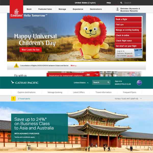
Cathay Pacific Airways
At this point, Cathay Pacific is a breath of fresh air. The site is generally keyboard friendly. The links have underlines, the menus are usable with a keyboard, and most items on the page have a focus style.
The site has an accessibility statement that primarily talks about users with visual impairments. From within the site there is even a control to enlarge the text on the page, though it doesn’t carry over to the home page.
As you scroll down the page, an overlay banner appears to show the site logo and represent the site navigation in a hamburger menu. The problem is when you reverse-tab back up the page, this has the effect of partially covering elements you want to see.
The tab control works with a keyboard, which is great and easy. Unfortunately, the fields themselves visually hide the labels and rely on placeholder text that has insufficient contrast.
From just a keyboard and contrast perspective, the site gets a lot right though.
Turkish Airlines
Turkish Air brought me back down. Without any focus indicators, it’s nearly impossible to see where you are on the page.
When booking a flight, form controls such as the city search or calendars get no focus and cannot be activated via the keyboard. Not only that, you cannot change the dates by typing, a theme which carries into the passenger count. There are plus/minus images (spans) which cannot receive focus, and typing a number, hitting the Enter key or space bar all have no effect.
Thanks to the use of tabindex, the visual order does not match the tab order. The search icon (it’s supposed to be an an input type="submit", but due to a type it’s just a text field with a magnifying glass background image) has tabindex of 1, but the search field itself has no tabindex. You’d have to press the Tab↹ key 18 times to enter search text.
A more compelling example of the keyboard problems: it will take you 28 presses to get to the Check in
tab on the home page, 3 more presses to get to the fields to choose between e-ticket or reference number, then 145 tabs to get to the field itself to enter your number (which has tabindex of 21).
Contrast for the content is generally good, though links often lack enough contrast between themselves and the background color and the surrounding copy color. The lack of any focus styles also means no contrast change when the links are selected.
Emirates
Like the close of a good fairy tale, Emirates made me hopeful again.
Not only does Emirates use focus styles throughout the home page, it even has a Skip to main content
link that works (by using a button to script around the Chrome bug). In fact, the very first link in the tab order is to an accessibility statement (though the link is visually hidden). It’s not just boiler-plate either, it was written with some thought, echoing the effort I see on the site.
Here we learn that the site uses accesskey, which while they can be problematic, leans primarily on numbers for navigating the site elements, seemingly based on the old UK government standard.
Most of the expanding elements on the page can be quickly collapsed by pressing the Esc key, including a user-activated video. The Esc key implementation can use some tweaking, as it doesn’t always put the focus back where the user was when activating the control. Many of these items have a Close
link as well, though it’s not always first in the flow.
While there are a few javascript:void(0) links on the page, the control that allows you to choose between booking or checking in is coded so if the JavaScript fails, the link itself will take you to a real page.
Particularly exciting is that not only do the calendar controls to work with the keyboard, they support the arrow keys to quickly move through them.
Contrast is generally very good. The links in the body copy can use some work as they don’t have enough contrast to indicate hover states (they are easier to see when tabbing through them) and they have no underlines.
Update: April 25, 2016
I often forget how many airlines there are, as well as how often they miss the mark on the simplest things.
This display turns the aircraft red for available flights.
— Paul Fenwick (@pjf) April 25, 2016
I'm colour blind.
Thanks, @Qantas.#UXFail pic.twitter.com/0LKKAIpR56
Update: July 18, 2016
This link came across my timeline from Laura Carlson. It is a reminder that despite legislation requiring airline web sites to be accessible, that does not mean they will be.
The most recurring issues were a lack of visible focus, skip links, and context for screen readers, along with confounding calendars.
Read the entire article (Airline Web Accessibility: Post US DOT Deadline Round Up) to get the scoop, but here is a quick score card.
Position Airline Score 1 Latam Airlines 4 out of 5 2 Ethiopian Airlines 3 out of 5 2 Norwegian Airlines 3 out of 5 2 Qantas 3 out of 5 5 Delta Airlines 2.5 out of 5 6 Singapore Airlines 1 out of 5
Leave a Comment or Response