Under-Engineered Toggles
Updated Intro
Whether you use a <button> or <input type="checkbox"> for your toggle depends on a few factors:
- Use
<button>if:- you can count on JavaScript being available,
- flipping the toggle has an immediate effect,
- the toggle will never have an indeterminate state.
Go read Under-Engineered Toggles Too.
- Use
<input type="checkbox">if:- you want to progressively enhance the control,
- flipping the toggle will only take effect when the user submits it,
- the toggle may have an indeterminate state.
Continue reading this post.
Back to the Post
Toggle buttons feel like a favorite way for devs and designers to show off their animation, design, and pun skills. There is even a Codepen collection dedicated to toggles.
While I recognize that the bulk of these are fun experiments, experience has taught me that some developer somewhere will copy one of the experiments into a real user-facing project. These controls are overwhelmingly inaccessible and in many cases usability gotchas.
For this post, I am only going to provide styles to visually convert a standard checkbox into a visual toggle. No ARIA, no script, no special features. A progressively enhanced checkbox that will continue to work if the CSS file does not load, following in the approach of my post Under-Engineered Custom Radio Buttons and Checkboxen.
If you want to build a native-like toggle in function as well as style, then you need to look at the ARIA switch role, understand that a switch affects an application immediately, explain this to a user in plain text, and recognize that not doing this correctly could be a Level A WCAG violation.
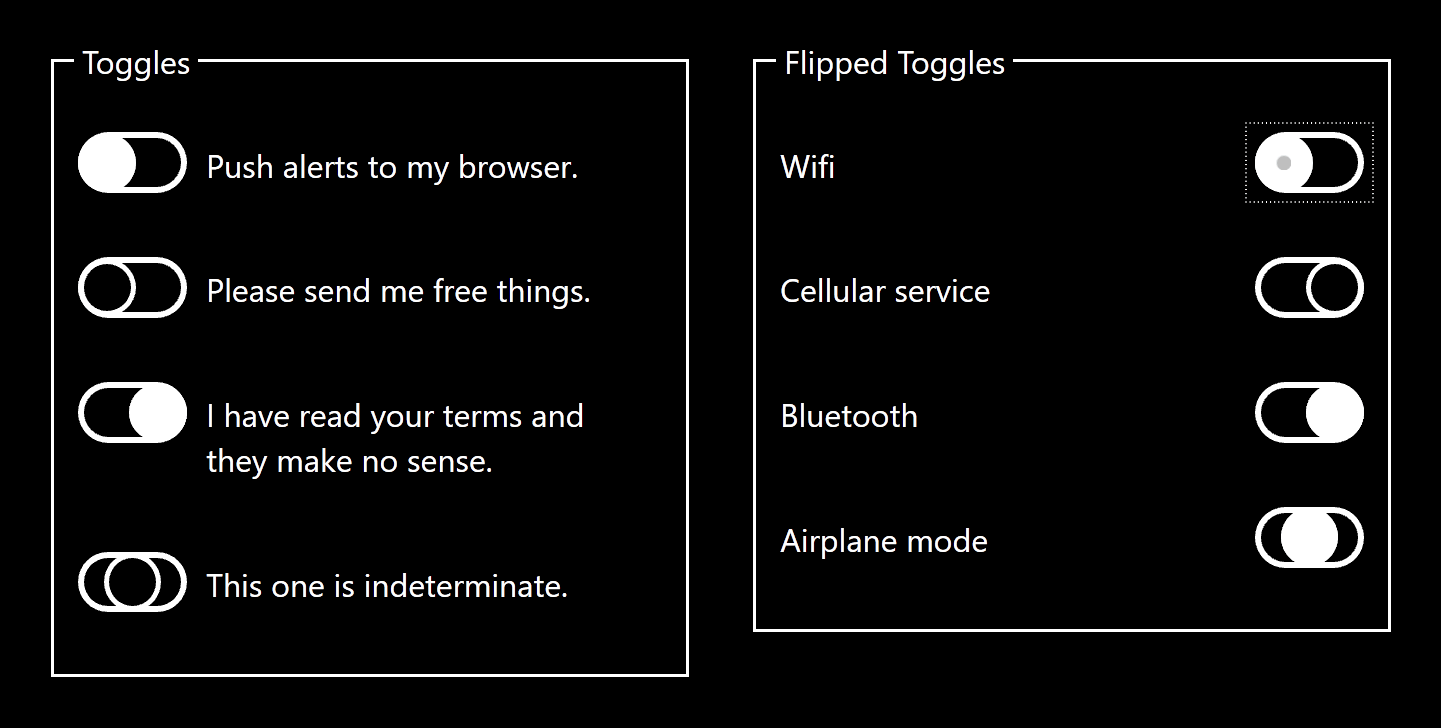
Example
This pen shows the default checkbox from your browser and also shows the styled checkbox. This simple example does not show all the possible states and features that you should support. You may immediately notice that it does not look exactly like the iOS toggle people expect, primarily because some accessibility and usability best practices have been applied. I cover all those below and at the end of this piece is an example showing everything wrapped up together in a set of toggles.
See the Pen Under-Engineered Toggles: Comparison by Adrian Roselli (@aardrian) on CodePen.
Visit the example pen directly if it does not load.
Basic Styles
As noted above, I lean on some existing code. I hide the checkbox without removing it from the DOM nor the accessibility tree. I use ::before to generate the pill and ::after to generate the thumb thinger. All sizing is done in ems so these will scale with the surrounding text. The gray (#767676) has a 4.5:1 contrast ratio with the white background while the green (#36a829) has a 3:1 contrast ratio with white. The selectors may look a bit verbose, but I avoided :not() as IE does not handle multiple selectors within it, thereby not shortening my code much.
.toggles [type="checkbox"] {
  position: absolute;
  top: auto;
  overflow: hidden;
  clip: rect(1px, 1px, 1px, 1px);
  width: 1px;
  height: 1px;
  white-space: nowrap;
}
.toggles [type="checkbox"] + label {
  display: block;
  position: relative;
  padding: 0.5em;
  padding-left: 4em;
  max-width: calc(100% - 2em);
}
.toggles [type="checkbox"] + label::before,
.toggles [type="checkbox"] + label::after {
  content: "";
  position: absolute;
  height: 1.5em;
  transition: all 0.25s ease;
}
.toggles [type="checkbox"] + label::before {
  left: 0;
  top: 0.2em;
  width: 3em;
  border: 0.2em solid #767676;
  background: #767676;
  border-radius: 1.1em;
}
.toggles [type="checkbox"] + label::after {
  left: 0;
  top: 0.25em;
  background-color: #fff;
  background-position: center center;
  border-radius: 50%;
  width: 1.5em;
  border: 0.15em solid #767676;
}
.toggles [type="checkbox"]:checked + label::after {
  left: 1.6em;
  border-color: #36a829;
  color: #36a829;
}
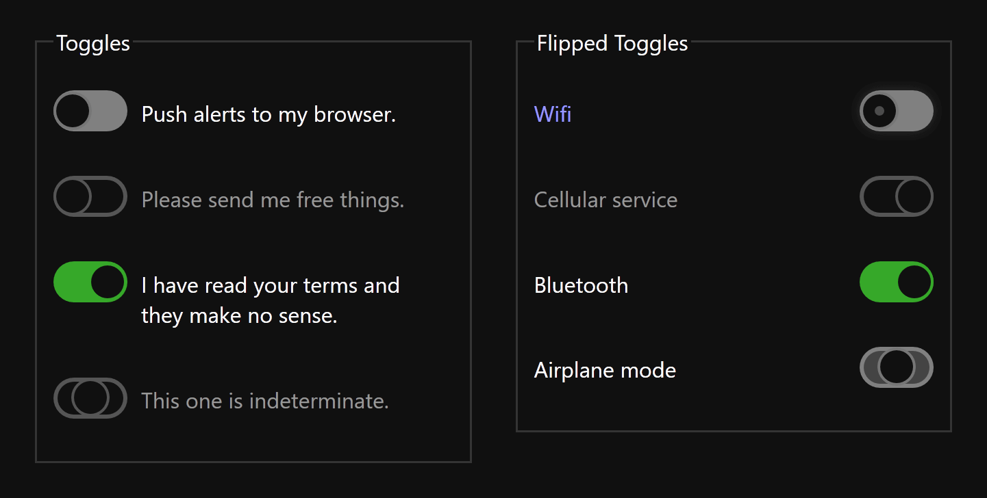
Focus and Hover
It is important to support keyboard users as well as touch and mouse users. Whatever hover styles you develop need to be clear and obvious when the user is tabbing through the page or focus is programmatically placed on the checkbox. I do three things here: I make the label text blue, I add a shadow to the entire pill, and I add a small disc to the thumb thinger.
On their own each might be too subtle, but when used together my limited user testing told me they did the job without overwhelming the interface.
.toggles [type="checkbox"]:focus + label,
.toggles [type="checkbox"]:hover + label {
  color: #00f;
}
.toggles [type="checkbox"]:focus + label::before,
.toggles [type="checkbox"]:hover + label::before {
  box-shadow: 0 0 0.5em #333;
}
.toggles [type="checkbox"]:focus + label::after,
.toggles [type="checkbox"]:hover + label::after {
  background-image: url("data:image/svg+xml,%3Csvg viewBox='0 0 100 100' xmlns='http://www.w3.org/2000/svg'%3E%3Ccircle cx='50' cy='50' r='50' fill='rgba(0,0,0,.25)'/%3E%3C/svg%3E");
  background-size: 30%;
  background-repeat: no-repeat;
  background-position: center center;
}
Disabled Checkboxes
Sometimes fields are disabled, and in native controls this is visually communicated by making them gray. Because there are no contrast requirements we have a little more room to play here. I honor the grayed-out approach by clearing the backgrounds and lightening the borders and text. While a disabled control cannot receive focus, it can be hovered so we want to undo those styles as well.
.toggles [type="checkbox"][disabled] + label::before {
  background-color: transparent;
  border-color: #ddd;
}
.toggles [type="checkbox"][disabled] + label::after {
  border-color: #ddd;
}
.toggles [disabled]:hover + label {
  color: #999; /* case for CSS custom property if not supporting IE/Edge */
}
.toggles [type="checkbox"][disabled]:hover + label::before {
  box-shadow: none;
}
.toggles [type="checkbox"][disabled]:hover + label::after {
  background-image: none;
}
Indeterminate State
Checkboxes have a third state (switch controls do not). This state is not set via HTML, but instead is set via script. You can do this in JavaScript: getElementById(idRef).indeterminate='true';
Most examples you will find do not take this into account. Most developers I interact with do not seem to know this, and are startled when their framework of choice returns the occasional indeterminate checkbox (assuming they can see it for the styles that do not account for it).
In this case, it is as simple as moving the thumb thinger to the middle and choosing a neutral background color. Because we address colors already for disabled checkboxes, we don’t need to do anything special for a disabled indeterminate case.
.toggles [type="checkbox"]:indeterminate + label::after {
  left: 0.8em;
}
.toggles [type="checkbox"]:indeterminate + label::before {
  background-color: #ddd;
}
Right Aligned
If my user’s experience with toggle controls is primarily from iOS, then you may want to put the toggles to the right of the text, instead of to the left as I do here. Mostly it is a matter of adjusting the label text so there is room to the right, and then placing your ::before and ::after on the right, offsetting the thumb thinger as appropriate.
.toggles.flip [type="checkbox"] + label::before,
.toggles.flip [type="checkbox"] + label::after {
  left: auto;
  right: 0;
}
.toggles.flip [type="checkbox"] + label::after {
  left: auto;
  right: 1.6em;
}
.toggles.flip [type="checkbox"]:checked + label::after {
  right: 0;
}

.toggles.flip [type="checkbox"]:indeterminate + label::after {
  right: 0.8em;
}
.toggles.flip [type="checkbox"] + label {
  padding-left: 0;
  padding-right: 4em;
}
Reduced Motion
The likelihood that the animation for the toggles will cause issues for some users is low. But there is also the chance the user scales the content so the toggle fills the screen, and at that size it could be an issue. Conveniently we can disable that animation with a feature query.
@media screen and (prefers-reduced-motion: reduce) {
  .toggles [type="checkbox"] + label::before,
  .toggles [type="checkbox"] + label::after {
    transition: none;
  }
}
Windows High Contrast Mode
Windows offers users a way to strip all the colors of a web page and replace them with a subset of user-defined system colors. You cannot define the colors, but you can specify which system color should get applied where thanks to keywords. Here we use a proprietary feature query and set all the colors that we need to convey the state of the controls.
@media screen and (-ms-high-contrast: active) {
  .toggles [type="checkbox"]:focus + label::before,
  .toggles [type="checkbox"]:hover + label::before {
    outline: 1px dotted windowText;
    outline-offset: 0.25em;
  }
  .toggles [type="checkbox"] + label::after {
    background-color: windowText;
  }
  .toggles [type="checkbox"][disabled] + label::after {
    background-color: transparent;
  }
}
WHCM Update: January 19, 2020
The new Chromium-based Edge (ChromiEdge) does not honor WHCM quite the same as in legacy Edge nor Internet Explorer 11, for which I have filed issues, so you will need to test your styles now and when this gets sorted.
Dark Color Scheme
In both Safari and Firefox pre-releases we have the prefers-color-scheme media query, which allows a user to choose to see a page that may have a dark theme. Honoring this is a matter of choosing good colors with good contrast. In my example, I reset the form to nearly black (#101010) and the text to white. The green still has good contrast (6.2:1), but I need to change the blue for the focused/hovered text and I change my border and background to a bit lighter (#808080) to get a 4.8:1 contrast ratio. You can see some other tweaks for the disabled and indeterminate states and the SVG I use on focus/hover.
@media screen and (prefers-color-scheme: dark) {
  form {
    background-color: #101010;
  }
  .toggles {
    color: #fff;
  }
  .toggles [type="checkbox"]:focus + label,
  .toggles [type="checkbox"]:hover + label {
    color: #99f;
  }
  .toggles [type="checkbox"] + label::before {
    border-color: #808080;
    background: #808080;
  }
  .toggles [type="checkbox"] + label::after {
    background-color: #101010;
  }
  .toggles [type="checkbox"]:not([disabled]):indeterminate + label::before {
    background-color: #444;
  }
  .toggles [type="checkbox"]:focus + label::after,
  .toggles [type="checkbox"]:hover + label::after {
    background-image: url("data:image/svg+xml,%3Csvg viewBox='0 0 100 100' xmlns='http://www.w3.org/2000/svg'%3E%3Ccircle cx='50' cy='50' r='50' fill='rgba(255,255,255,.25)'/%3E%3C/svg%3E");
  }
  .toggles [type="checkbox"][disabled] + label::before,
  .toggles [type="checkbox"][disabled] + label::after {
    border-color: #555;
  }
}
Right-to-Left
Let’s not forget that sometimes content we write gets auto-translated into other languages. Sometimes those language are not a Western language like you are reading right now, but might be a right-to-left (RTL) language like Arabic or Hebrew. If you are tweaking this code to use in a library of your own that might be deployed outside of your site, it may end up in a language you did not anticipate.
While I may not know Persian or Urdu, I can ask around for someone who does know a RTL language and confirm some assumptions. Mostly we know that not only does the text direction change, so does the toggle direction. So we have to flip everything for it to make sense. If context warrants a swapped toggle and text (such as native applications), then we have to flip that as well.
*[dir="rtl"] .toggles [type="checkbox"] + label {
  padding-left: 0;
  padding-right: 4em;
}
*[dir="rtl"] .toggles [type="checkbox"] + label::before,
*[dir="rtl"] .toggles [type="checkbox"] + label::after {
  left: auto;
  right: 0;
}
*[dir="rtl"] .toggles [type="checkbox"] + label::after {
  right: 0;
}
*[dir="rtl"] .toggles [type="checkbox"]:checked + label::after {
  right: 1.6em;
}
*[dir="rtl"] .toggles [type="checkbox"]:indeterminate + label::after {
  right: 0.8em;
}
/* Put toggles on the right like the iOS the kids like */
*[dir="rtl"] .toggles.flip [type="checkbox"] + label::before,
*[dir="rtl"] .toggles.flip [type="checkbox"] + label::after {
  left: 0;
  right: auto;
}
*[dir="rtl"] .toggles.flip [type="checkbox"] + label::after {
  right: auto;
  left: 1.6em;
}
*[dir="rtl"] .toggles.flip [type="checkbox"]:checked + label::after {
  left: 0;
}
*[dir="rtl"] .toggles.flip [type="checkbox"]:indeterminate + label::after {
  left: 0.8em;
}
*[dir="rtl"] .toggles.flip [type="checkbox"] + label {
  padding-right: 0;
  padding-left: 4em;
}
Wrap-up
When we pull all that code together we can have a robust set of toggle styles that can adapt to user preferences for text size, contrast, language, motion, and interaction mode. As more features become available to us to honor user preferences and platform features, then we can fold those in as well.
See the Pen Under-Engineered Toggles by Adrian Roselli (@aardrian) on CodePen.
Recap
What this post covered:
- Using only checkboxes with CSS to enhance them;
- Supporting disabled controls;
- Supporting mixed state checkboxes;
- Scaling with text styles, honoring WCAG 1.4.12: Text Spacing (A);
- Colors meeting minimum 3:1 contrast ratios, honoring WCAG 1.4.11: Non-Text Contrast (AA);
- Supporting Windows High Contrast Mode;
- Supporting
prefers-reduced-motion; - Supporting
prefers-color-scheme; - Supporting printing (did not need to even call it out);
- Avoiding the switch role;
- Working with RTL languages;
- Avoiding color-alone focus styles by using a dot on the thumb thinger;
- Working in IE11, Edge, Firefox, Chrome, Safari.
I considered making that a toggle checklist, but that seemed unnecessary.
Update: 7 August 2019
I finally got the other half (part two) of this piece published: Under-Engineered Toggles Too
In it I use <button aria-pressed="true">, the other way to create a toggle, and apply the same styles so it visually looks exactly the same as the examples in this post.
9 Comments
Cheers for that comprehensive guide. Curious about that last line of the checklist regarding the
:notpseudo-selector. MDN states that it’s supported since IE9 (https://developer.mozilla.org/en-US/docs/Web/CSS/:not), what issues does not using it avoid?
In response to . I was asked the same question on Twitter, and frankly since I fiddled with this over the course of a few months before I wrote this post, I have forgotten. I had a note about
:not()along with IE in my original code, so I wrote it up. I will have to go back and see what the issue was, if there was one.
In response to . I avoided the
:not()because IE does not support multiple selectors within it. I decided it did not simplify my code enough to warrant its use. I think I made that decision early on and just forgot it, lumping it into a general IE issue bucket in my head. All the more reason I need to keep good notes when I keep putting these experiments down.
In response to . Ah, I see, cheers for the precisions :) Got me worried that there was some edge case I could fall into when using
:not()with single selectors inside. Relieved!Keep the hard work with your articles, they’re super useful!
This post was inspirational. This kind of design is very popular and I’ll certainly bookmark this guide as my go-to resource when tackling this issue in the future.
What really stood out to me was how in depth you were with your build in accounting for all the various use cases. I often feel conversations around progressive enhancement is often limited to new fun features and less about the important use cases such as reduced motion and high contrast settings.
Sir,I am an amateur. If I may ask, what is a thumb thinger ? Thanks
In response to . I make up phrases, so that was unhelpful of me. I am referring to the visible white circle that moves / slides back and forth in the oval.
Hi,
I have a question regarding the switch. In terms of WCAG, is ok if we change only color from gray to green and the position of the thumb? Doesn’t this violate SC 1.4.1 Use of Color? I know that we also use the thumb to highlight the change, but not sure if every user knows which side means on and off.
Thanks a lot.
In response to . The moved circle means it passes 1.4.1 and does not rely on color alone. However, since the control is known to often be confusing, particularly when only one is shown and there is nothing for comparison, you may want to look at Scott’s method of putting the word in the control.
Leave a Comment or Response