Infographically Disinclined
I don’t care for infographics. Their original purpose of visually conveying otherwise complex information has been superseded by their current use as marketing drek with “quirky” illustrations, blocks of prose, and the occasional useful factoid.
The love affair with inforgraphics is confounding to me as a web developer. They are often deployed on the web as a giant image that typically has text too small too read, that cannot be selected, and doesn’t include any kind of accessibility affordance. In short, the likelihood I can get one them to display properly in anything other than a desktop web browser is slim.
Doing It Wrong
This example in particular seems to epitomize the poor planning and execution of the typical infographic.
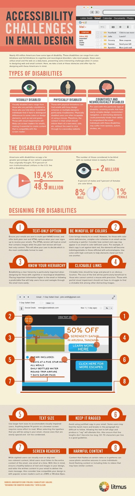
It is intended to convey the challenges of designing and building HTML-formatted emails for users with disabilities. Got that? It’s an infographic about accessibility best practices.
How many ways is this doing it wrong, just from an accessibility perspective?
- All of the text is set as an image. There is no selectable text.
- At default zoom settings, the text is too small.
- The text and background colors don’t provide enough contrast.
- The numbered examples require extensive scrolling to see the accompanying text.
- The blog post of this infographic has useless
alttext (“Accessibility-Email-Design-1000px”). - The title of the blog post is easily as useless (again, “Accessibility-Email-Design-1000px”).
- The blog post itself has no other content. No words, no explanation, no plain-text equivalent.
- The option to embed the infographic on your site perpetuates the same inaccessible content.
Feel free to suggest more.
I’d also like to qualify that if your infographic is primarily text, you’re doing it wrong. All text save for two useless pie charts and a fake screen capture do not make up for the volume of copy stuffed into this image.
Another example of doing it wrong: NASA’s Falling UARS Satellite Explained
Doing It Right

This simple and direct infographic isn’t even meant to be an infographic, but it conveys quite a lot of information in very little space with very few words. In fact, this information is conveyed better visually, with no words, than as long blocks of prose.
At a quick glance you can see the height that the ice achieved relative to familiar landmarks and relative to each of three other cities. No long-winded explanations, no pointless pie charts, just familiar context and simple references to learn more. This is data visualization, simply put.
Another example of doing it right: Wind Map
Giving It a Go
I figured that, on a lark, I’d make my own infographic using HTML and CSS and code it so that it’s accessible. Then I realized that I don’t have a topic I think is best represented by a graphic. Nor am I a data visualization expert. So I cheated and made a Venn diagram (often labeled as an infographic, even though it’s a diagram) about infographics:
Cannot copy text.
Large download.
Forgot its roots.
Cannot copy text + Large download = Flash
Large download + Forgot its roots = Animated GIF
Cannot copy text + Forgot its roots = Text as image
Cannot copy text + Large download + Forgot its roots = Infographic
I also made a version on CodePen if you want to hack it for your own use.
Related
- We’ve Reached Peak Infographic, and We’re No Smarter for It
- 70 best infographics on the web (The number keeps changing as they add more and retweet it, also, I disagree with the assertion in the title.)
- Why your Brain Craves Infographics (I’ll give them credit for building it in HTML, even if it’s still a text-laden scroll-a-thon.)
- WTF Visualizations: Visualizations that make no sense (added September 12, 2013).
- Creating an Accessible Infographic (added September 23, 2013).
- Accessible Infographics (added February 6, 2014).
Update: November 11, 2013
SMBC put together a great infographic this weekend, The Top 6 Reasons This Infographic Is Just Wrong Enough to Sound Convincing. It struck a cord with some at Slate, because it got re-purposed over there with a lot of handy links to other infographical horrors: Why Infographics Are Terrible, in One Terrible Infographic.
Update: January 6, 2014
Derek Featherstone has found an infographic that is made up of text. Yep. Text. Check out “The Health Hazards of Sitting” at the Washington Post and maybe take a cue from it.
Leave a Comment or Response