Avoid the Hamburger Menu for Desktop Layouts
This is, to some extent, a response to the article at Usability Geek titled Making A Case For The Desktop Hamburger Menu (which I had the Wayback Machine capture because I have learned my lesson). I left a comment on the article, but it motivated me to write something on my own site.
The Issue
There has been a disappointing trend for some time now where sites rely on a hamburger menu to hide the primary navigation when viewed at desktop screen resolutions.
As a user of a reasonably large display, I find it frustrating to have to grab my mouse and click just to see a menu of what the site has to offer. Personal preferences aside, we already know hiding navigation tends to make it more difficult for the average user, but compounding it with an interface element that is familiar only to those who use mobile sites is tantamount to thumbing your nose at a large segment of users.
There are lots of opinion pieces already out there. Instead of adding yet more rant, I’ve opted to point you to some readings grounded in research, user studies, and experience:
- From Nielsen Norman Group:
For desktop sites, demoting your main content categories into a drop-down menu makes it harder for users to discover your offerings.
- Also from Nielsen Norman Group:
On a large screen, hiding the chrome significantly affects discoverability and interaction cost, with virtually no improvement to the content-to-chrome ratio.
- The word
menu
generally performs better than the three bars, should you feel a need to implement it. - Citing a Paralysis of Choice argument is usually a false equivalency, especially since research that is cited is typically based on purchasing physical goods (like different flavors of jam), and not on exploring a navigation menu.
- Usability firm Catalyst says hamburgers on desktop can be useful in limited circumstances, while providing a list of what to do and not to do.
Not only do all the documented usability issues with hamburger menus on mobile apply, most pre-built hamburger menu scripts fail to support keyboards well, and usually not at all. This alone makes a hamburger menu on desktop an even greater accessibility failure than on a non-keyboard-controlled device.
Examples
I pulled each of these examples from the 2015 Webby Awards winners, which tends to reward visual design and novelty over true usability (as evidenced by its award for the Virgin America site about which I’ve written before).
Sometimes it’s hard to help people to understand where a pattern or concept fails unless you can demonstrate it in action. All screen shots were captured at 3,000 × 1,750 pixels.
The first two example sites are targeted at the general public, namely tourists and recreational visitors. As such, there is no guarantee that these users have much, if any, experience with the hamburger menu prevalent on mobile sites. Neither page has a singular call-to-action, and the Visit California page even uses the text Scroll to discover
(which is not a very good call-to-action). Further, the Visit California page doesn’t even support keyboard navigation, something usually not even coded into pre-built hamburger menus targeted at mobile users.
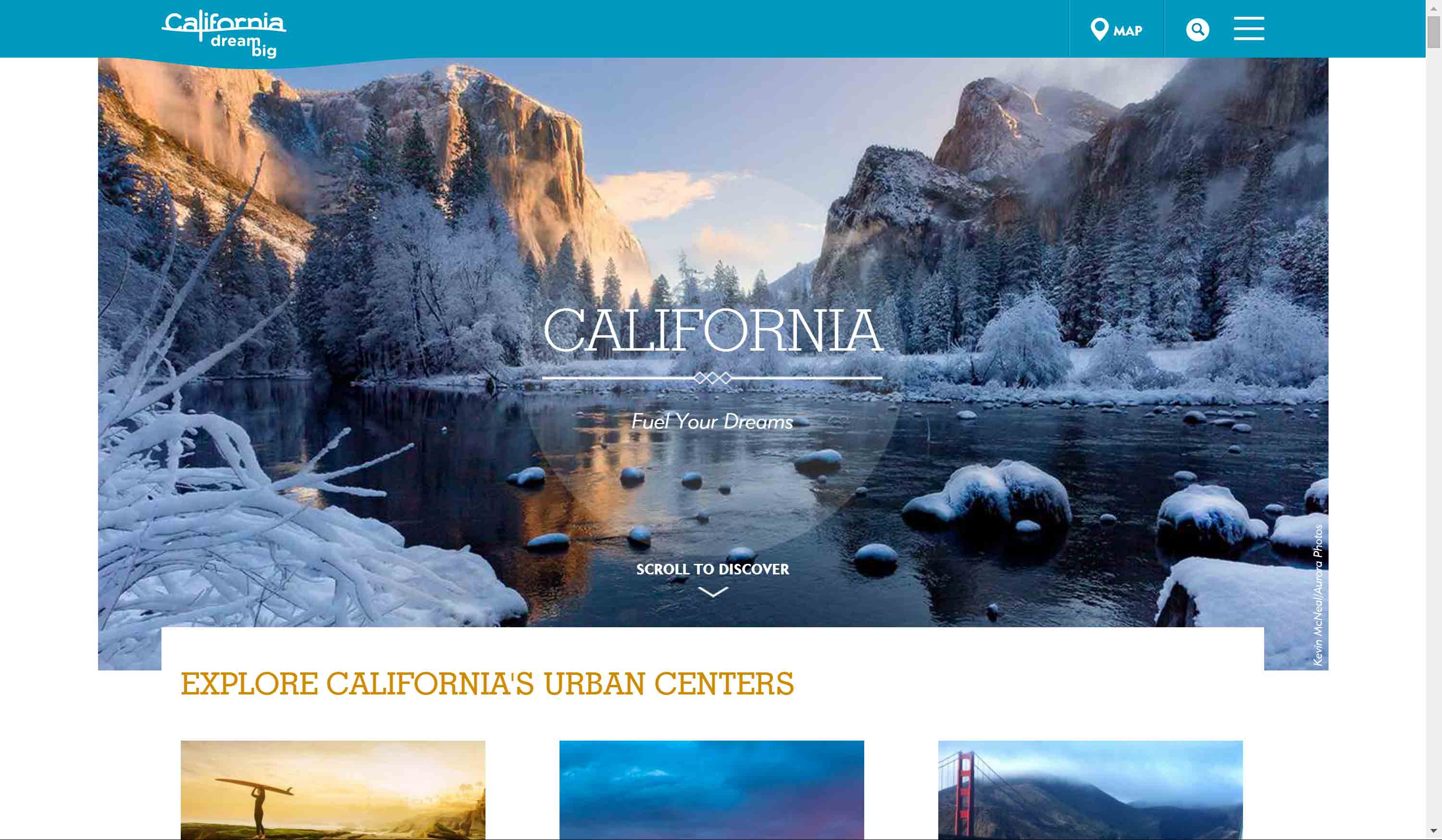
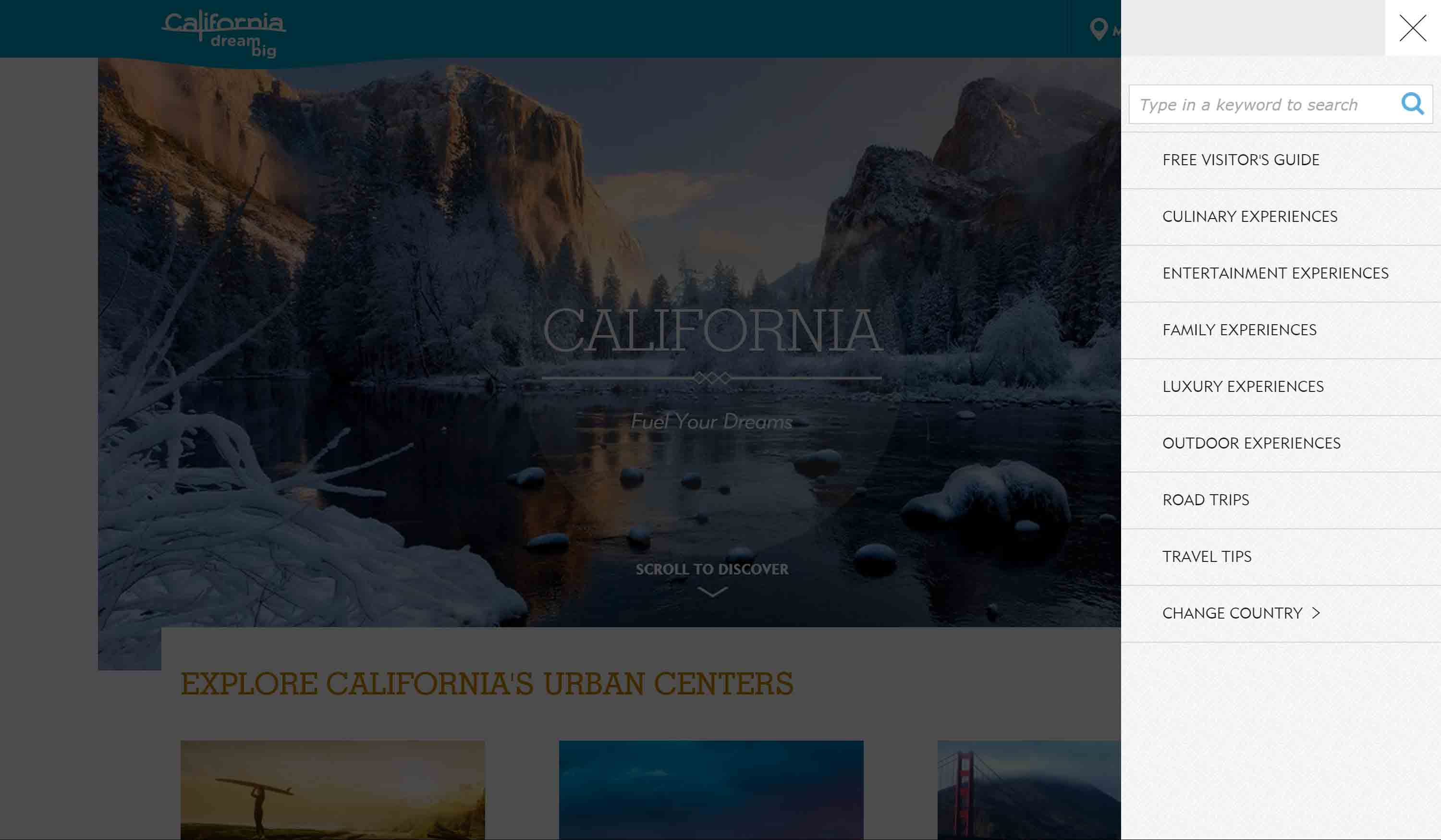
2015 Webby Award Winner in the Associations category, Visit California.
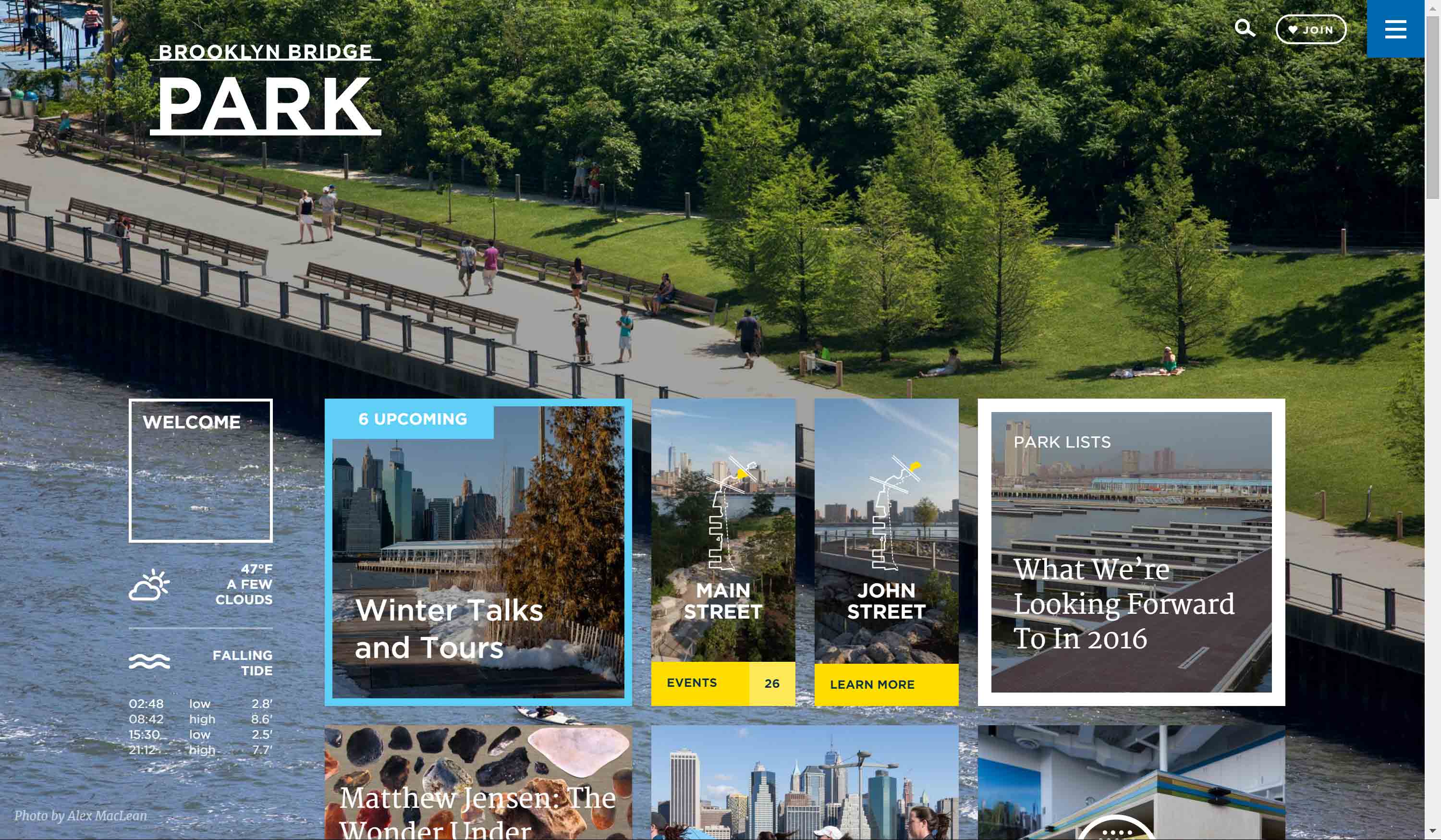
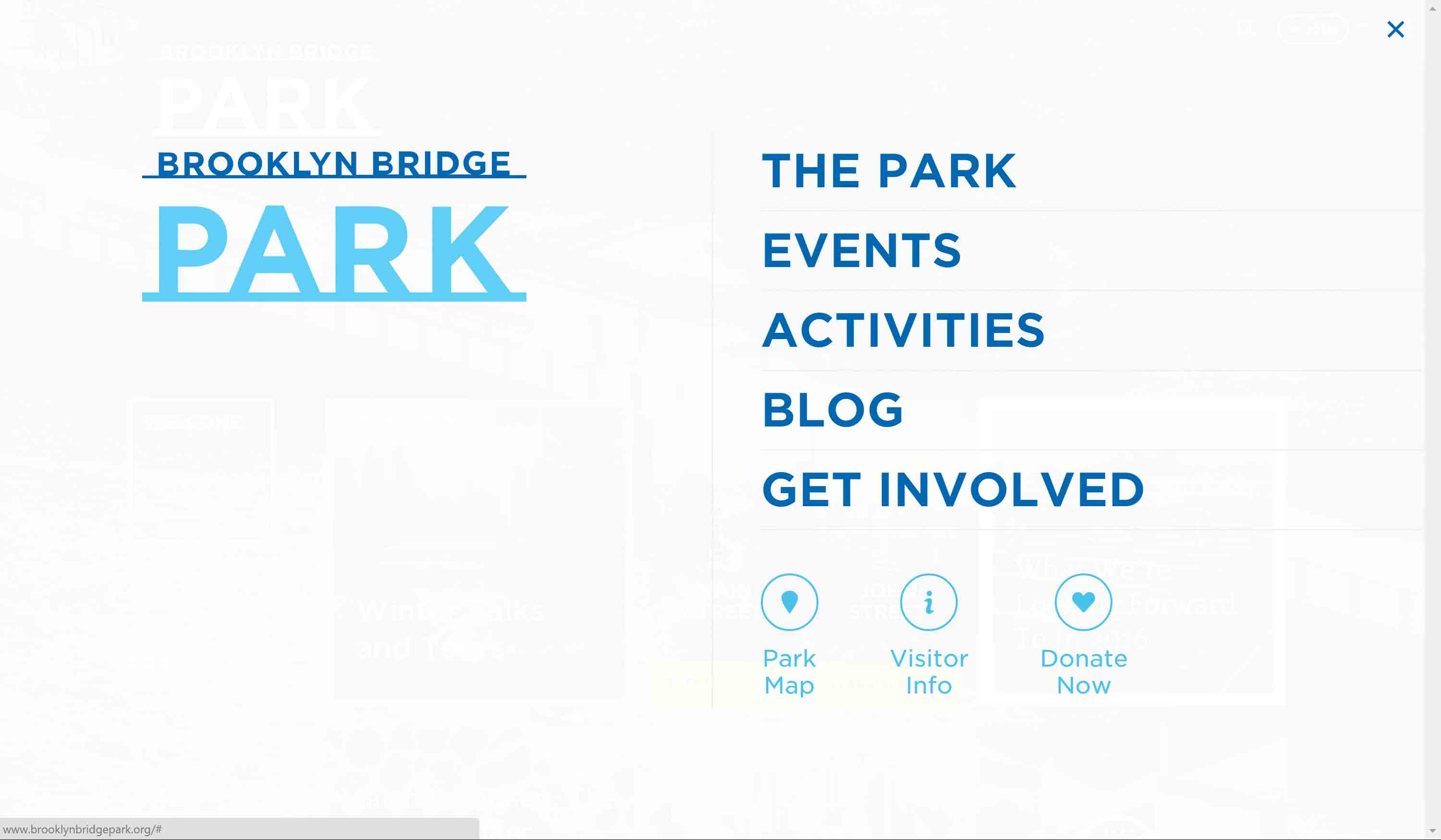
2015 Webby Award Nominee in the City & Urban Innovation category, Brooklyn Bridge Park.
These next two sites are not necessarily targeted at the broadest range of the general public, but they also suffer from a lack of a clear call-to-action on the home page. The Design Museum has three calls-to-action, each one taking its own screen which can only be seen when scrolling. Illusion Magazine leads with a full-screen carousel before a grid of image links — with a keyboard-inaccessible menu.
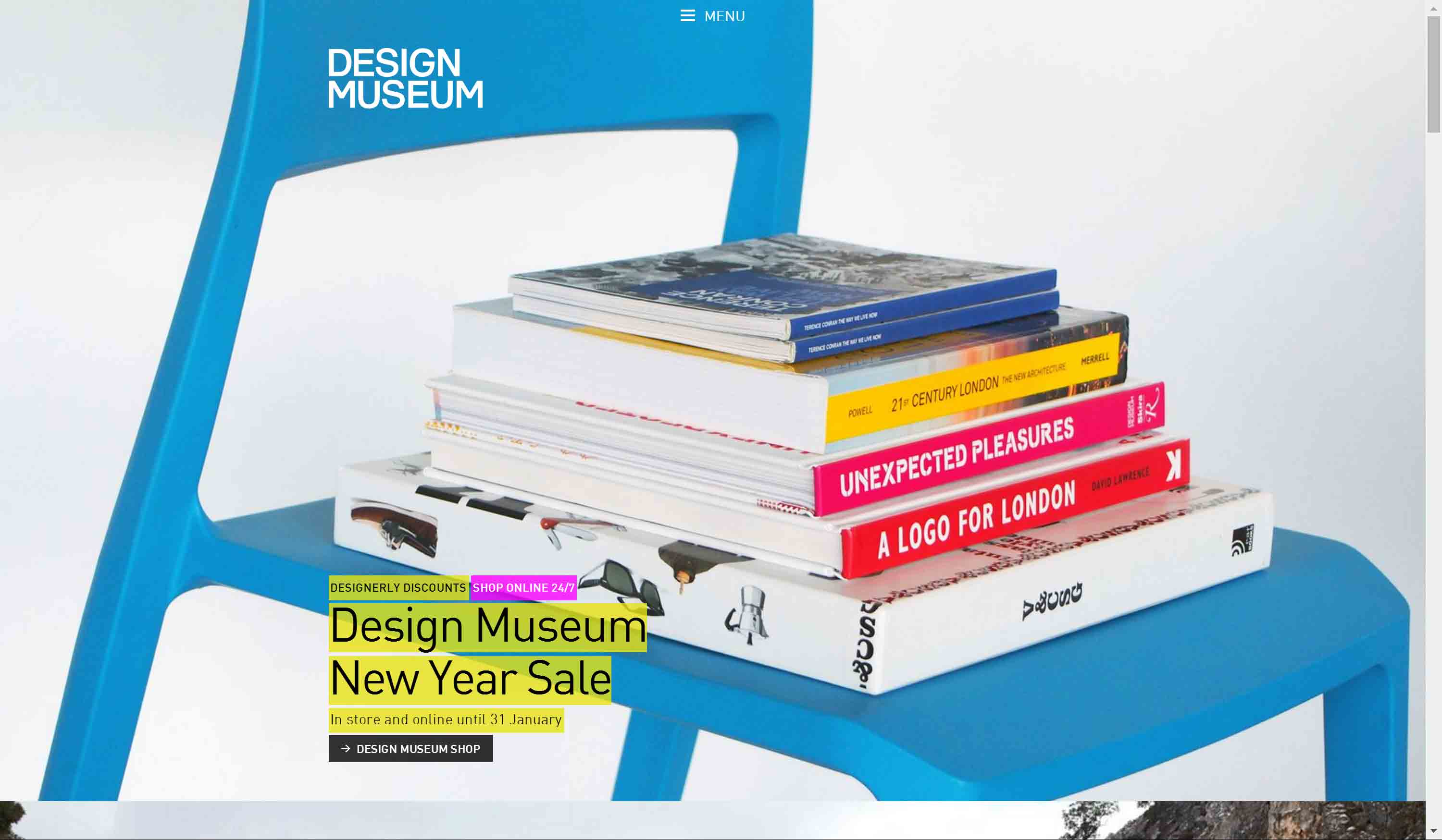
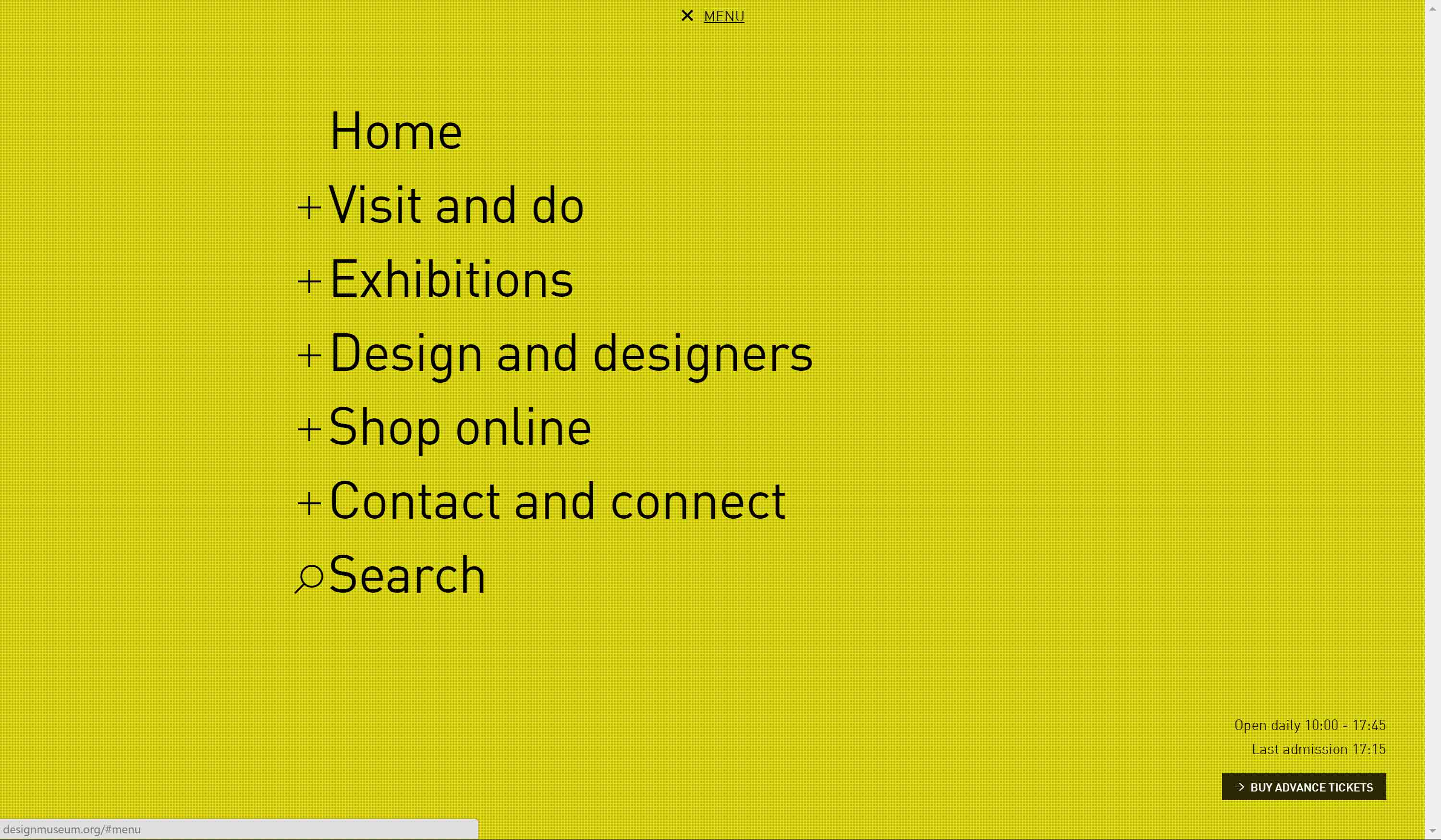
2015 Webby Award People’s Voice in the Best Navigation/Structure category, Design Museum.
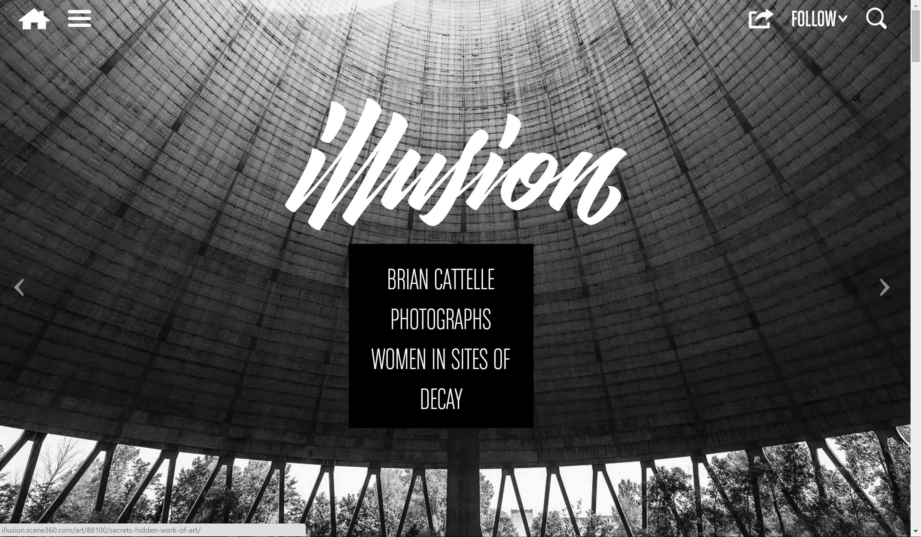
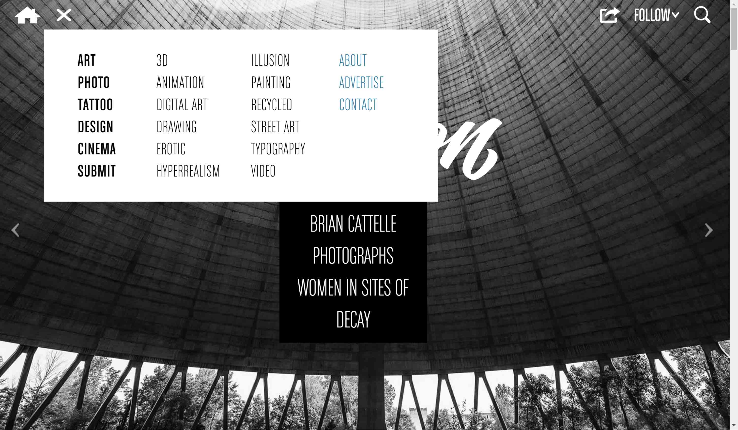
2015 Webby Award Winner in the Art category, Illusion Magazine.
The Lexus Performance site is a scroll-only novelty site. Normally I wouldn’t bother including it except it does two things I find amusingly out of touch. The first is that it has an additional hamburger menu below the primary hamburger, though it uses three dots instead of lines. The second is that the entire primary menu displays on page load, and then quickly collapses into a hamburger, teasing the user. This is amusing to me because it happens on every page load (with files cached) and it is clearly a mistake. You can see a screen shot of it in the third image below.
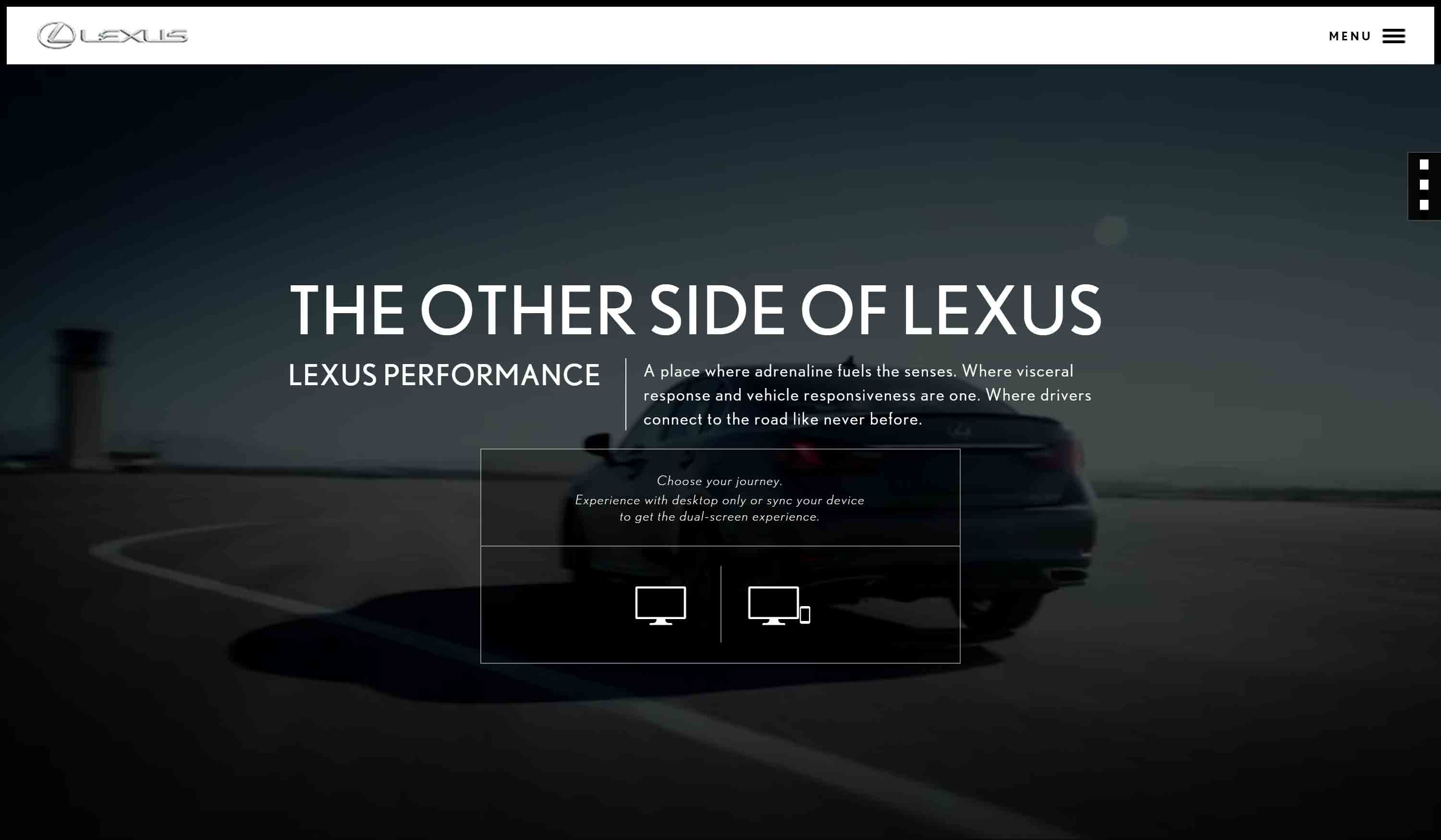
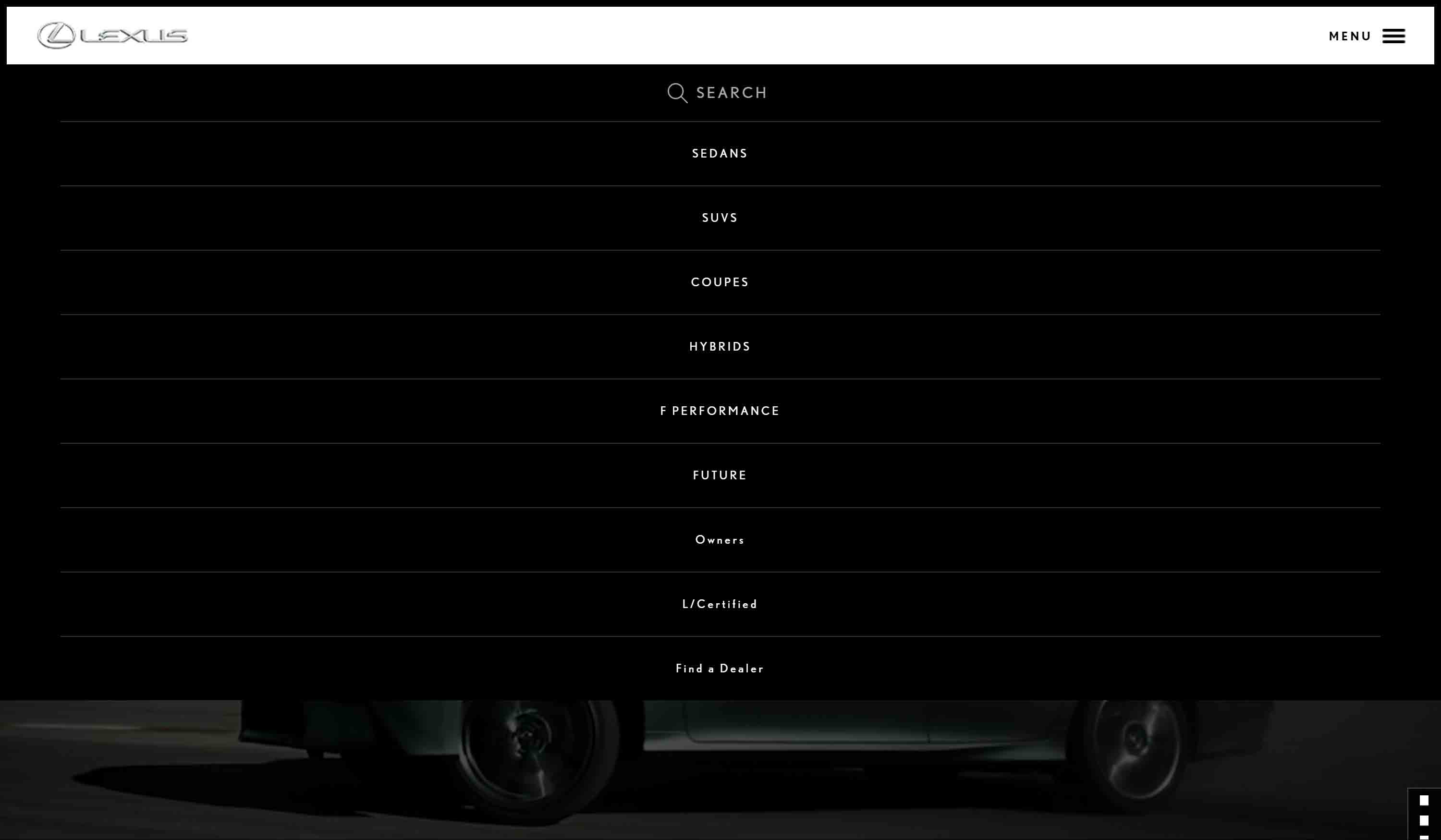
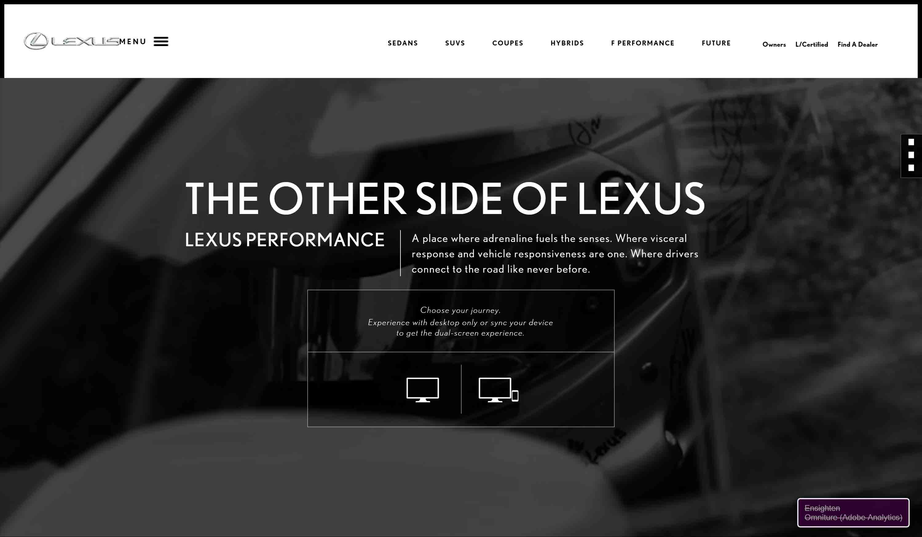
2015 Webby Award Nominee in the Car Sites & Car Culture category, Lexus Performance.
Conclusions
Essentially, if your argument in support of a hamburger menu on desktop is to help drive visitors to your singular call-to-action, then you have done nothing more than created a splash page. You are using the 1990s version of the modern pop-up, so good on you for reinventing the square wheel.
I encourage you to identify your objective (driving a user to a specific page is not an objective, a conversion is an objective) and then measure clicks and follow-on actions. Ideally try some A/B testing to help limit the likelihood that you are just building tests to support your preconceptions. Following these navigation UX tips from Nielsen Norman is probably a good step too.
But if you opt to do it anyway, test the menu. Make sure it is keyboard accessible. Make sure it has an accessible name and that it conveys its current state. Make sure it works in the browsers that visit your site, not just your or your client’s favorite browser.
Update: January 12, 2016
In the post The Navigation Bar Is an Affordance, Stop Removing It, the author argues that making navigation blend into the hero image makes it harder to see and therefore harder to use. In my experience, that means a site is one step away from hiding it behind a hamburger altogether. If you see them in the wild, it may be your last chance to save them.
Update: January 18, 2016
In defence of the hamburger menu argues that the hamburger has a place, though it seems some on the Twitters have misunderstood what he said:
the Hamburger menu is part of an emergent design language that resulted from the rise of responsive design. It solves a difficult problem (how to represent a potentially large number of menu items on a small screen) in a relatively neat and tidy way.
First, he mentions small screen. Second, he said it addresses navigation in a neat and tidy
way, which I think is still very much up for debate. I don’t argue that it is gaining traction simply from its constant use.
Update: January 24, 2016
In Hamburger, hamburger, hamburger, Jeremy Keith discusses the hamburger without defining desktop versus mobile. He does provide this simple approach to identifying if the hamburger is effective:
- Representation: It depends. Is it representing a stacked list of menu items? If so, good. If not, reconsider.
- Usage: it depends. Is it being used as an excuse to throw literally all your navigation behind it? If so, reconsider. Prioritise. Decide what needs to be visible, and what can be tucked away.
- Clarity: it depends. Is the icon labelled? If so, good. If not, less good.
Update: April 7, 2016
The hamburger menu and the zombie apocalypse is a tongue-in-cheek analysis of the burger in the mobile context, but I think it applies very much to desktop.
Great web design is about putting the customer in control of their journey, not controlling their journey. Great web design is functional and fast-downloading, not some carousel of organizational egos. The next time your customer wants a link, please don’t give them a hamburger.
Update: May 4, 2016
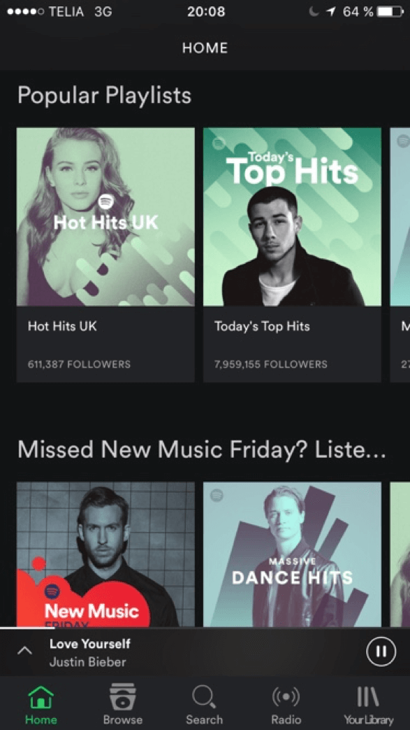 As we see more and more sites targeting desktop screen sizes using hamburger menus, mobile apps are recognizing the value in moving away from hamburgers. The latest is Spotify.
The company tested the tab bar on iOS to see how it impacted user engagement. It found that users with the tab bar ended up clicking 9% more in general and 30% more on actual menu items. The tests also revealed that reducing the number of options in the tab bar to five increased the reach of Spotify’s programmed content, the company says.
Update: June 27, 2016
It seems anyone does any kind of measurement or research on hamburger menus (particularly at desktop sizes), they perform poorly. More from Nielsen Norman Group in the article Hamburger Menus and Hidden Navigation Hurt UX Metrics:
Our quantitative usability testing of hidden menus (such as hamburger icons) and visible menus (such as links across the top of pages) reveals that:
- Hidden navigation is less discoverable than visible or partially visible navigation.
- When navigation is hidden, users are less likely to use navigation.
- If people use hidden navigation, they do so later in the task than if it were visible.
- Hidden navigation provides a worse user experience than visible or partially visible navigation does, in both mobile phones and desktop user interfaces. This finding holds true across multiple UX metrics including users’ assessment of task difficulty, time spent on task, and task success.
- On desktops, hiding navigation degrades the experience and the navigation discoverability more than it does on the phones.
- Hiding the navigation mostly affects content that is not directly accessible through an in-page link.
Update: April 6, 2017
More than two years since I posted this, and sadly hamburger menus still appear regardless of how wide the site displays. In this latest example, all I wanted to do was see what other recipes might be in the current section. Without breadcrumb or visible site navigation, I had to try the hamburger. Since I run with Ghostery (which blocked 75 trackers on this example), I had the added bonus of a broken hamburger. The video below shows the trick I found to make it work.
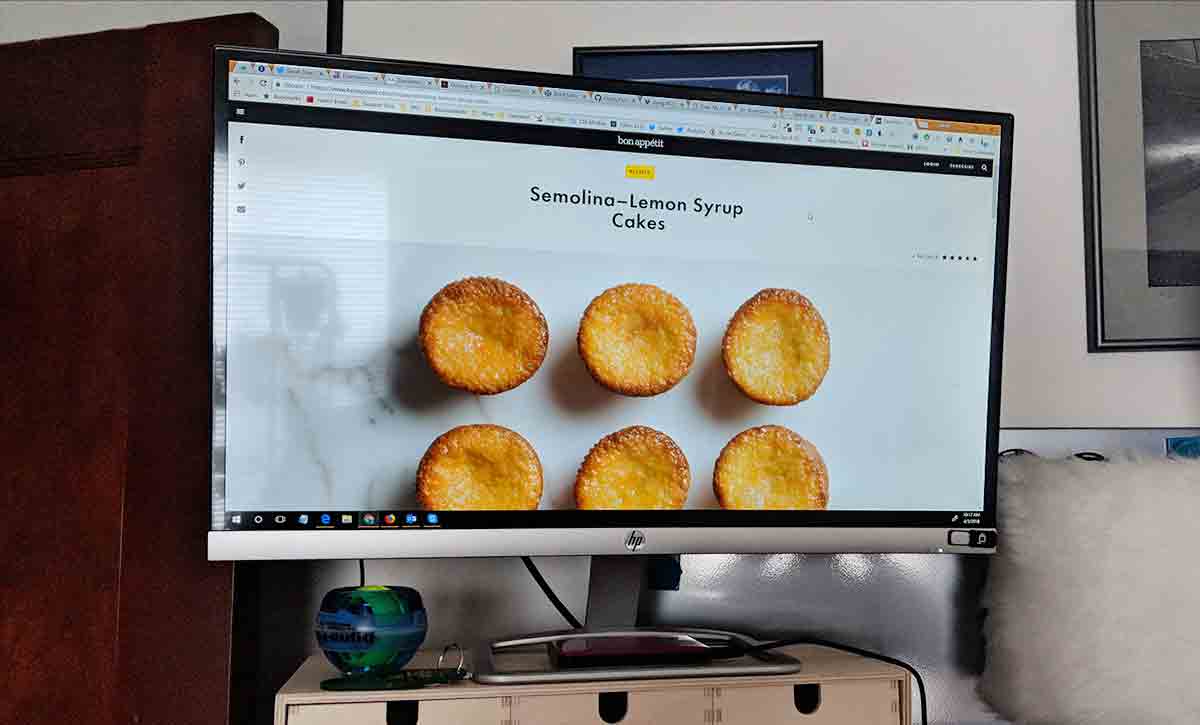
If you are curious about the recipe in the example, it is Semolina–Lemon Syrup Cakes and no I have not made it yet.
Mini-update: I made the muffins. They need some tweaking.
10 Comments
Some of the new WordPress themes use a hamburger menu at desktop size. I consider it a sign of poor design.
In response to . Agreed. I find it also an indicator of an inaccessible theme.
I too really dislike the hamburger menu on larger screens. It’s just a sign of either laziness or lack of skill from the designer and/or developer.
The way I tend to do it is display the standard horizontal menu on larger screens, and below a given threshold display the burger burger icon with ‘menu’ and ‘close’ text next to it depending on the state.
e.g. http://wasabiweb.se/Ideally though if there’s only a limited number of items I’d try to avoid the hamburger menu on all screens.
[…] I want to show examples of terrible user interaction patterns, I just hit the top Webby Award […]
Thanks for writing this article. I’ve been trying to make the case of not using hamburgers on desktop to a coworker and this article is a great source of other research and thoughts on the matter.
[…] Update (15-10-2016): kwam nog een ander goed artikel tegen over dit onderwerp met vele voorbeelden en verwijzingen naar relevante blogs / artikelen / websites en onderzoeken. Het gaat om een blog van Adrian Roselli met de titel Avoid the hamburger menu for desktop layouts. […]
I do know what a Hamburger menu is …. but I rarely “see” it.
If I do see one I almost never click on it …. because it has rarely been fruitful.
Why ?
Because any website using a Hamburger seems to suffer from generally poor navigation , i.e. unclear, ambiguous, insufficient or curious choice of click-options.
One wonders whether there is some sort of design “arrogance” along the lines of….
– “Visitors should just “know” how to navigate.”
– “I want to guide (dictate) the Visitor’s pathway.”
– “My design priority is “cool”.”If you want me (and others) to stay ….. please provide a proper Menu/Nav bar – with tabs, borders and colour gradients.
Thanks for writing this article. It’s an icon that has spent decades embedding itself in the social consciousness as the button where users can access the navigation drawer and i am using it here: digitalwebbyra.se
Please tell me if i am wrong about using it on desktop …
In response to . Yes. For all the reasons I cited above.
Adrian, Thank you. This page is one of first ones on the google query hamburger menu desktop. I found very useful the Nielsen Group comments, which usually will shut any Marketing and Designer Square Wheel inventor, I hope.
I fully support your fight, and I am sad that seems that your are losing, as more and more minimalistic desktop sites are embracing this herp-derp design pattern.
Be ready for a fixed footer with five icons next. What a time to be alive. <3
Leave a Comment or Response