It is not uncommon to see developers and designers forego creating focus styles for controls on web sites and applications. For those who are aware of the need for the focus styles, the most common reason I hear for excluding them is that the browser provides focus styles by default so nobody has to struggle with designing a focus style that both looks good and satisfies WCAG (specifically WCAG 2.0: 2.4.7 Focus Visible). This assumes the default style is not removed, of course.
This is particularly problematic when in-content links (in particular) are the same color as the surrounding text and/or have no underlines. Since those are common design patterns, unless a designer or developer uses the keyboard to navigate a page the issue may never become apparent.
It doesn’t help that in some cases (Chrome, Opera) the browser doesn’t scale the focus style as the user zooms the page or the text is scaled. On the bright side, I found at least one bug has been filed so far to make the defaults better (against Firefox).
Examples
The following two examples allow you to play around on your own. In each case the text passes WCAG 2.0: 1.4.3 Contrast (Minimum), so these would pass a WCAG audit.
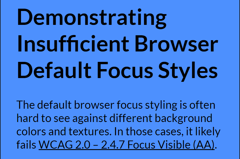
Background Texture
Internet Explorer, Edge, and Firefox all use a dotted line to indicate focus, which, as this example shows, can be a problem on textured backgrounds.
I did not even need to make a custom page to demonstrate the problem with Chrome’s blue focus ring. I could have just gone to the Chrome help pages to see it in action (thanks to Jason Kiss for politely telling Google).
Screen shot of a link with the blue Chrome focus ring on the blue background of the Chrome help page.
To break that down, the background of that part of the page is #4285f4. The focus ring color is #4d90fe. The contrast ratio between them is 1.14:1. To meet WCAG 2.0 level AA requires a contrast ratio of 4.5:1 for normal text, and while this is not text getting the style, I maintain that in the absence of any other indication of focus, by that standard this focus ring is not visible.
Update: September 24, 2017
Thanks to a tweet from Dennis Lembrée, I found another example where relying on the default focus indicator is nearly invisible in Chrome. Despite some other contrast issues, this one is technically not the fault of the developer but addressing it would make the controls that much more usable.
Screen shot of a series of controls with the blue Chrome focus ring on the blue background of the example page. In this composite screen shot, every control has focus to demonstrate the effect.
To break this one down, the background of that part of the page is #5996C9. The focus ring color is #4d90fe. The contrast ratio between them is 1.02:1. And yes, I offered style suggestions in an issue on the GitHub project.
Update: May 29, 2018
In its final 🖕 to keyboard users, Virgin America makes background color of page the same color as Chrome / Firefox / Safari focus ring.
The page has a blue background. The link is styled as a box with a white background. The link has focus, but the blue focus ring is lost against the blue background.
To spare you eyedropping…
Foreground:
#4E8FFE
Background:
#0F64CE
Contrast ratio:
1.8:1
Text
failed at Level AA
Large text
failed at Level AA
Update: June 4, 2019
Hidde de Vries has a new post at Mozilla Hacks, Indicating focus to improve accessibility, where he recommends not just keeping the focus for all interactive controls, but also going beyond the browser defaults.
If you grab the latest Edge Dev release, which mine reports as Version 79.0.301.2 (Official build) dev (64-bit) after an update, then you can see these in action. You will not see it in Chrome (yet), however.
Update: April 2, 2020
It took three years, and the efforts of Microsoft, but Chrome has updated its default focus indicator. In the post Updates to Form Controls and Focus there is an example of the old focus style on a blue background, demonstrating the problem I outline above.
But it’s currently not possible to replace the default focus styles without side effects, is it? For instance, in Chrome, if you style the :focus selector, the focus styles will also apply when the user clicks a link with the mouse, which we don’t want. (There are JavaScript workarounds like what-input, however.)
Has there been an effort to improve the default focus styles? I’d be much happier if browser vendors fixed this issue themselves ;-)
I am not certain what side effects you mean when replacing browser defaults. Regardless, I am not advocating replacing them, I am advocating not relying on them.
As for the focus styles coming into play on a mouse click, I disagree that we don’t want that. It depends on the design, the designer, the client, and the user.
I cannot speak to efforts to improve the default focus styles within browsers, but I did find an issue filed against Firefox (linked in the third paragraph). I agree that browsers need to do better.
Totally, 100% agree. My father is visually impaired with macular degeneration and I had to switch him over from Firefox to Chrome just because of this one issue. The dotted line is just too subtle and he definitely cannot see it.
“I am not certain what side effects you mean when replacing browser defaults.” coming in late on this, but: modern browsers use heuristics that only show the default outline focus style under certain conditions. in most situations nowadays, the default focus is not applied to, say, links or buttons when they were clicked with the mouse, but only when they were navigated to with the keyboard (from memory, Firefox does a heuristic where only after the user TABbed at least once on the page it then sets default focus style, regardless of how the user activated/clicked). Whereas setting explicit :focus style will always apply that style, regardless of whether the user used keyboard or mouse…which can lead to unsightly of confusing results (classic example: take two buttons that trigger some kind of in-page behavior; set an explicit focus style; user mouse-clicks on one, the action happens, but the strong focus style is applied…now, visually, the button looks different, making a user think it’s more like a toggle, or maybe disabled, or…)
In any case, :focus-ring should help here (being able to specify not only the focus style, but making it only apply in same situation as the default focus indicator, so heuristics used by modern browsers as above will be used/applied here too).
I hate to pick at things – but I find it hard to read into this article too much when the focus styles on this site itself are so hard to distinguish. Tabbing through the links removes the underline, and I can’t really tell what’s going on.
In the past I liked the idea of using default browser focus styles because WCAG technique G165 suggests it makes it possible for users to carry over their platform’s focus style via system-wide settings. Ideally that sounds like it would give better flexibility to the user, but I always wondered how common that setup actually is. Because if users are unfamiliar with that setup, and their focus visibility experience is lousy, then it’s just a lousy experience.
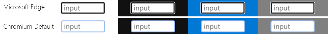
Recently though it seems like major browsers are using improved focus styles that have decent intrinsic contrast. The new Edge and Chrome focus styles look pretty robust (aside from outlier scenarios, like black buttons on white). And Firefox and IE have a white and black dashed line (just 1px, but doesn’t seem too bad?).
So I guess I’m wondering, will default browser focus styles ever be good enough to recommend? Or is that approach always too unreliable? I guess maybe it should be concerning that browsers are obliged to meet UAAG but not WCAG, and I am not sure what UAAG says about focus contrast…
Brian, I think default focus styles will never be good enough to warrant a blanket recommendation. Accounting for designs, site styles, custom settings, plug-ins, and so much more leaves too much room for gaps.
Lately there are a lot better than they were, so if choosing between none and defaults, go with the default.
Browser defaults have gotten far better since I wrote this post (at least in Chrome, thanks to Microsoft’s efforts). That being said, I would avoid flashing given that flashing can be a WCAG violation if not done carefully.


Leave a Comment or Response