Periodic Table of the Elements
I built this for me. An audience of one. A way to keep sharp the skills that I am not always able to use on a project.
My requirements were simple: responsive (print, small screens), accessible (beyond screen readers), and kinda fun. Since it relies on a JSON data source it already requires JavaScript to function, but it still incorporates progressive enhancement (such as IE10 grid support). It skimps on supporting RTL languages because I do not know how the real-life Periodic Table of the Elements adjusts for those languages. See, I am not a chemist. Nor scientist.
A word of caution — this post is about a table of elements that is made up of non-table elements. If that sentence made no sense, then you should enjoy this. In other words, I may use the terms table and element in a confusing fashion.
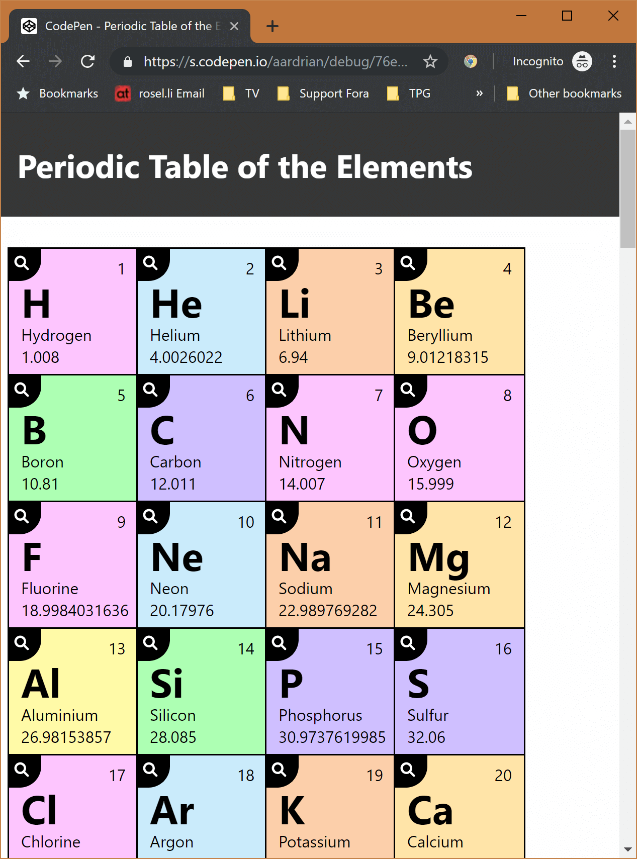
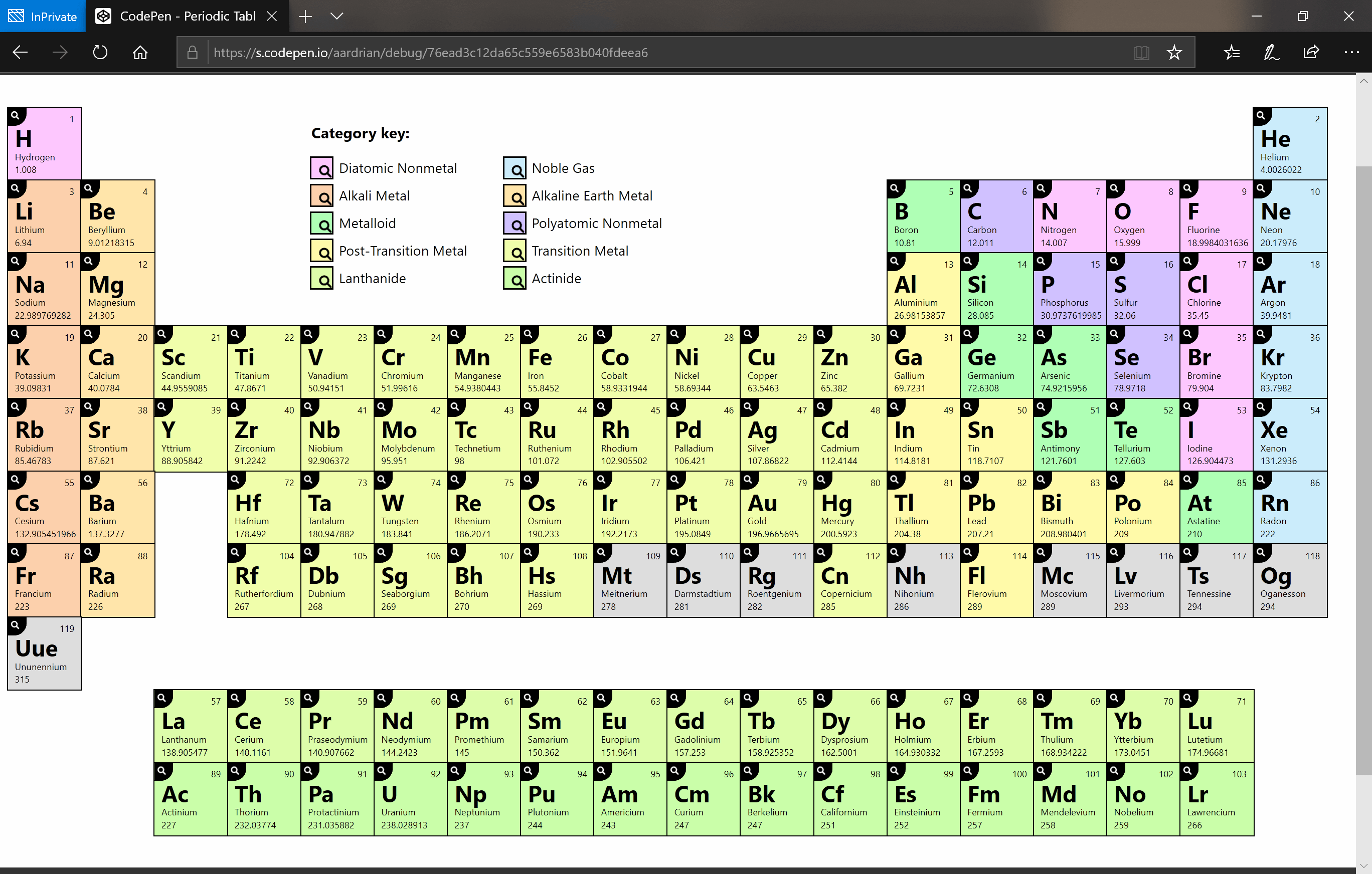
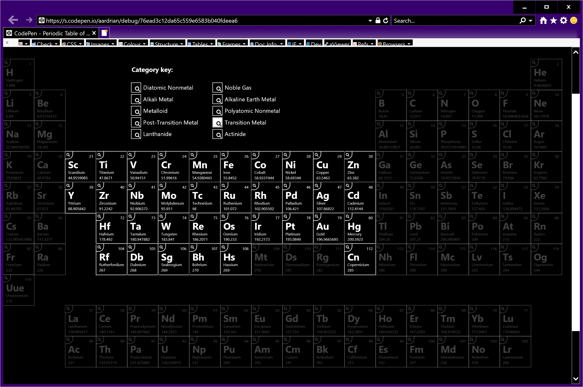
See the Pen Periodic Table of the Elements by Adrian Roselli (@aardrian) on CodePen.
Toggle between 1×, 0.5× and 0.25× in the bar at the bottom of the embed to see it change. You can also visit a debug version of the demo, which removes all the CodePen wrapper and script.
General Notes
I asked on Twitter about sharing this as a tutorial or just a fat Codepen. The general feedback was tutorial. Then I realized I made an offer I could not honor owing to time constraints. So I wrote this instead. An overview of a work in progress.
I built this to lean on as few dependencies as possible. Custom fonts may be a given, but in general there is no reason you cannot lean on a system font. While I dislike that Segoe, Helvetica, Roboto, and others make it hard to distinguish a 1 from an l from an I, for my purpose they are good enough.
This demo also does not set a base font size. It uses ems and rems for sizing, meaning it will key off the user’s default text size, whether actively chosen or not. It will also honor the user’s zoom setting.
I show code snippets throughout this post, but they are often trimmed or taken to show just one aspect at a time. The code blocks in this post do not contain everything that is happening in the demo.
The Data
The data comes from Periodic-Table-JSON, a JSON version of the Periodic Table of the Elements, and is used under Attribution-ShareAlike 3.0 Unported (CC BY-SA 3.0). That means that you can build your own Periodic Table of the Elements from the same source, or extend it to contain information not in there now. You can take my parsing script and make it into any HTML structure you want.
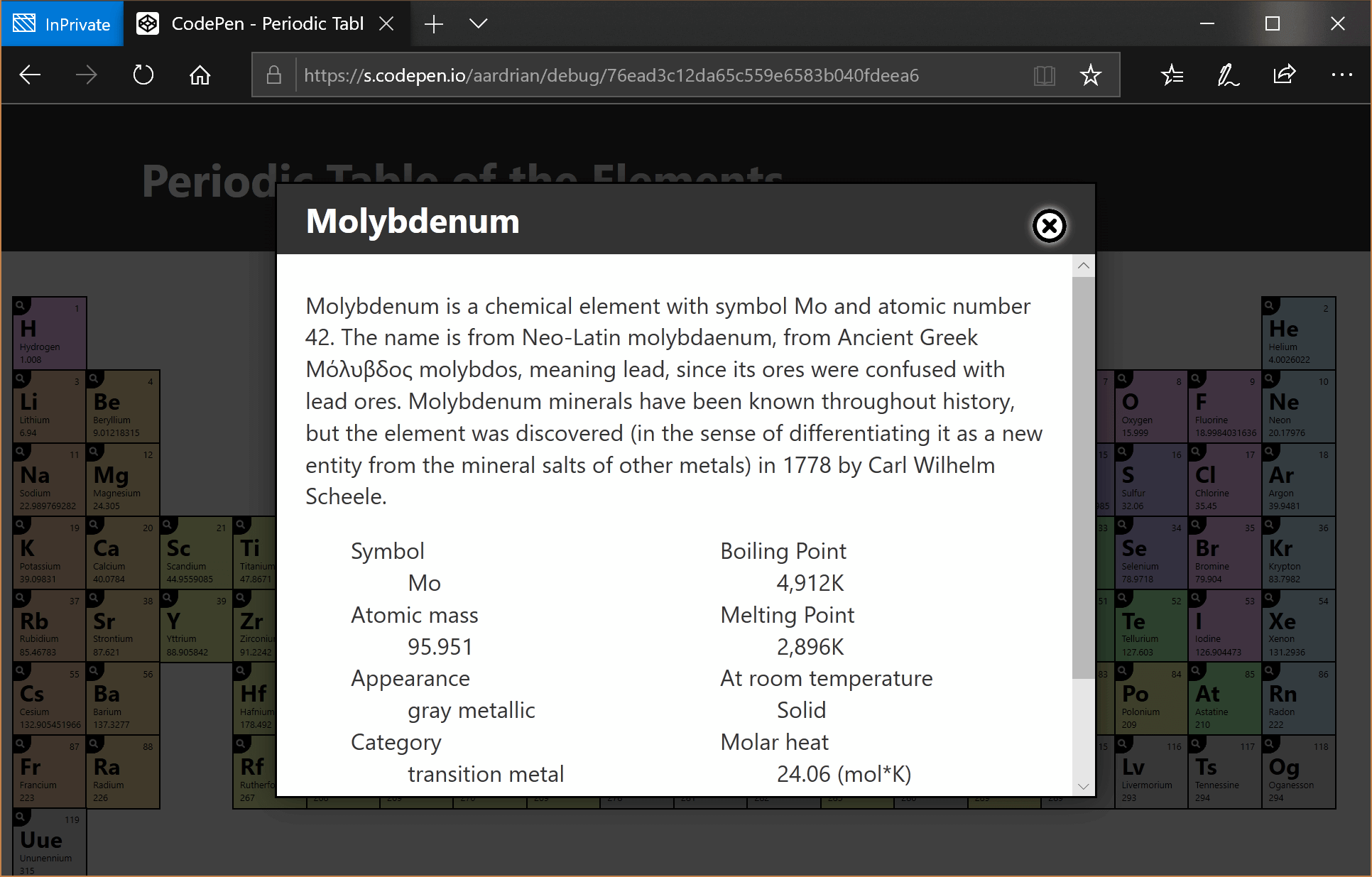
Following is just the Molybdenum data (with the ionization energies stripped) as an example of the structure.
{
    "name": "Molybdenum",
    "appearance": "gray metallic",
    "atomic_mass": 95.951,
    "boil": 4912,
    "category": "transition metal",
    "color": null,
    "density": 10.28,
    "discovered_by": "Carl Wilhelm Scheele",
    "melt": 2896,
    "molar_heat": 24.06,
    "named_by": null,
    "number": 42,
    "period": 5,
    "phase": "Solid",
    "source": "https://en.wikipedia.org/wiki/Molybdenum",
    "spectral_img": null,
    "summary": "Molybdenum is a chemical element with symbol Mo and atomic number 42. The name is from Neo-Latin molybdaenum, from Ancient Greek \u039c\u03cc\u03bb\u03c5\u03b2\u03b4\u03bf\u03c2 molybdos, meaning lead, since its ores were confused with lead ores. Molybdenum minerals have been known throughout history, but the element was discovered (in the sense of differentiating it as a new entity from the mineral salts of other metals) in 1778 by Carl Wilhelm Scheele.",
    "symbol": "Mo",
    "xpos": 6,
    "ypos": 5,
    "shells": [
        2,
        8,
        18,
        13,
        1
    ],
    "electron_configuration": "1s2 2s2 2p6 3s2 3p6 3d10 4s2 4p6 4d5 5s1",
    "electron_affinity": 72.10,
    "electronegativity_pauling": 2.16,
    "ionization_energies": [
…
    ]
}
Pay attention to xpos and ypos as those will come in handy for layout.
Layout
The first place I started for the layout was choosing my HTML. I want to represent the atomic elements in a way that preserves meaning when only the semantics and structure of the page are available. Since there are a finite number of atomic elements and their position in an overall count is important, I opted for an ordered list (<ol>). Each atomic element lives in a list item (<li>), natively presenting a count for screen reader users.
Note that VoiceOver does not support list nor list item navigation. Since each list item also has a button, that allows VoiceOver users a way to quickly move through the atomic elements. Here is my HTML for Molybdenum:
<li id="Mo" class="row5 col6 cat-transition_metal">
 <div>42</div>
 <div>Mo</div>
 <div id="nameMo">Molybdenum</div>
 <div>95.951</div>
 <button type="button" id="btnMo" aria-labelledby="nameMo btnMo" onclick="OpenDialog(this.id,'Molybdenum');">details.</button>
</li>
Note that I do not define each bit of text in the box. Once a reader (me) knows what each means, it just adds visual noise. It is also too verbose for screen reader users (if I hid it visually) for the same reason.
Once I have implemented the most appropriate HTML structure I can move on to styling. This is the way we all do it, right?
Floats
At this point assume I have built the layout for the content in each individual box (the <li> holding the atomic element info). I want to make sure this can be more useful than a long-scroll stack of boxes. Not all browsers support CSS grid, and some viewports will be too narrow to show a legible Periodic Table in all its wide glory.
So, like a sinking container ship with a load of ping pong balls, I just float them all.
#Elements li {
  float: left;
}
#Elements ol::after {
  content: "";
  display: block;
  clear: left;
}
CSS Grid
Now we can engage in a little progressive enhancement with feature queries. For narrow viewports I do not need grid. I can wait until a wider viewport, but here I can at least start the ball rolling. I undo all the floats and grid them all (like a waffle maker?). Note I am not even trying to help Internet Explorer here. Floats are good enough for IE.
@supports (display: grid) {
  #Elements li {
    float: none;
  }
  #Elements ol::after {
    content: none;
  }
  #Elements ol {
    display: grid;
    grid-template-columns: repeat(auto-fill, minmax(8em, 8em));
  }
}
That last bit with the auto-fill just slots in as many 8em boxes will fit before moving to the next row. That last bit is also why I ditched IE support in this step. I got stuck, couldn’t get the syntax right for IE, realized floats were good enough at this viewport width, and moved on.
Wide Viewport
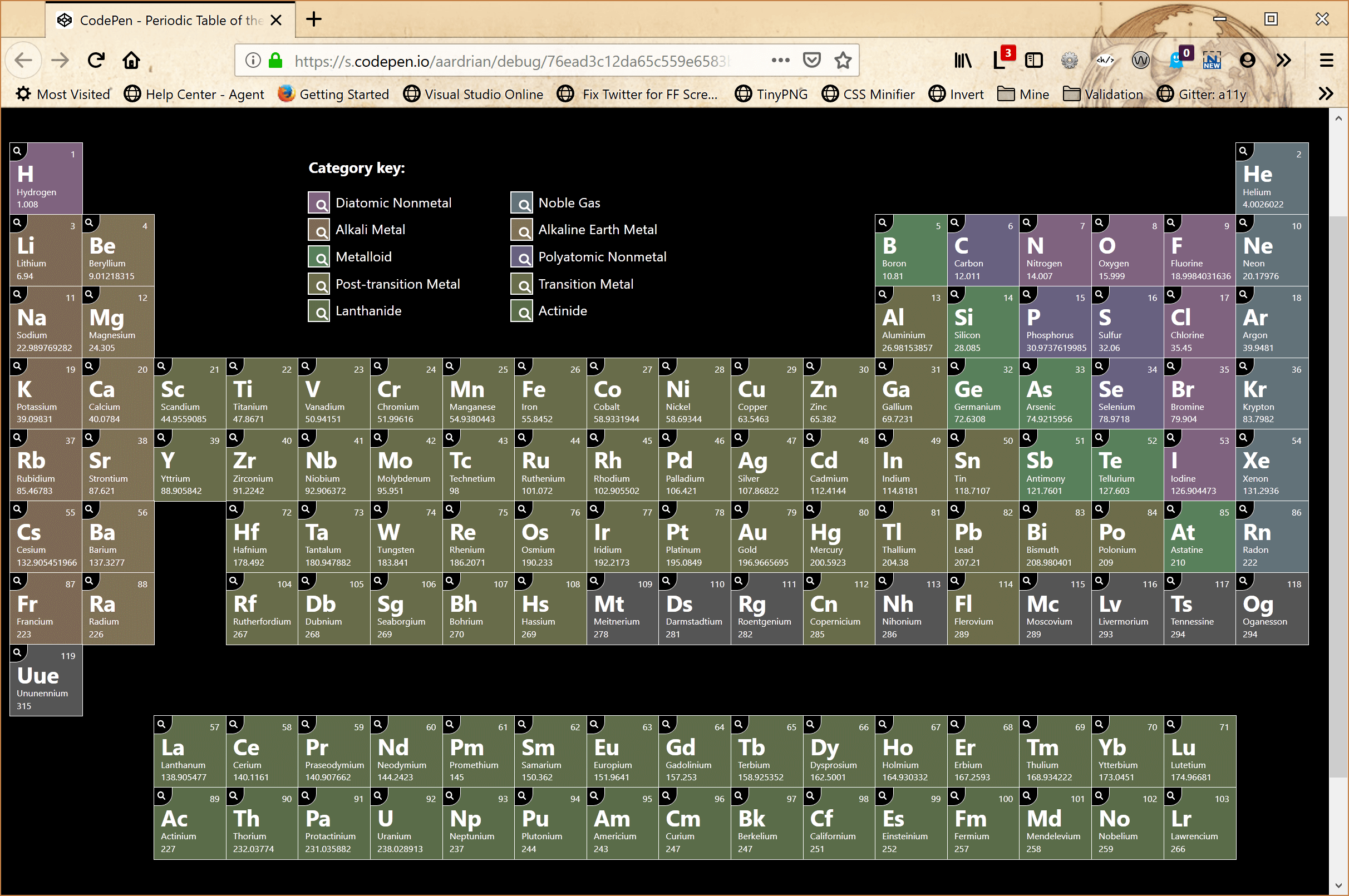
When we get to a sufficiently wide viewport (at an arbitrarily chosen minimum text size) we can set up our 18 column grid. Conveniently, we know exactly how many columns and rows to use, and even more conveniently the JSON tells us where to place each atomic element in the grid.
I grabbed the xpos and ypos values I mentioned above and made them into classes. Recall the HTML for the Molybdenum example above.
<li id="Mo" class="row5 col6 cat-transition_metal">
 […]
</li>
Note the row5 and col6 classes. That tells me exactly where to drop it in the following grid.
@media all and (min-width: 60em) {
  #Elements ol {
    font-size: .67vw;
    display: -ms-grid;
    -ms-grid-columns: 8em 8em 8em 8em 8em 8em 8em 8em 8em 8em 8em 8em 8em 8em 8em 8em 8em 8em;
    display: grid;
    grid-template-columns: 8em 8em 8em 8em 8em 8em 8em 8em 8em 8em 8em 8em 8em 8em 8em 8em 8em 8em;
  }
  li.row5 {
    grid-row: 5 / 6;
    -ms-grid-row: 5;
  }
  li.col6 {
    grid-column: 6 / 7;
    -ms-grid-column: 6;
  }
}
You may have noticed some -ms-grid properties. Adding them is not hard, and it allows your grid layouts to work for Internet Explorer users. A little extra testing, some redundant styles, and you net even more users. I consider that a differentiator for a site (or a developer).
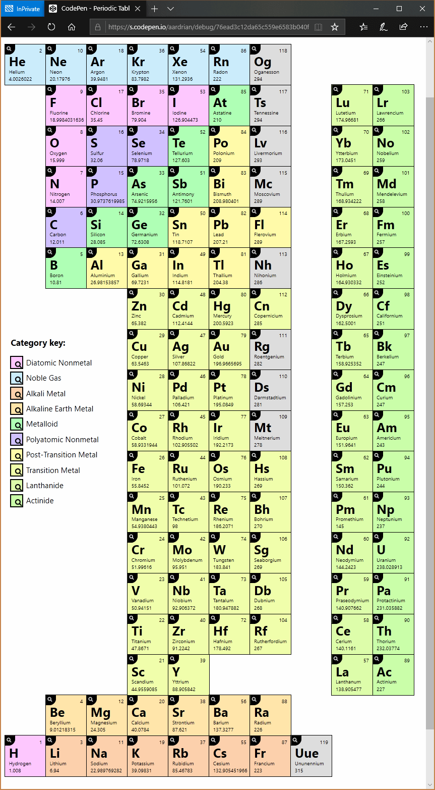
Less Wide Viewport
Fun fact — not everyone surfs in a wide window. Some users are on tablets, some users have rotated their screens to portrait, some users have zoomed into the page, some users run with large fonts. In those cases where the viewport is wide enough to hold 10 columns of data (at an arbitrarily chosen minimum text size), you can turn the Periodic Table on its head side.
I turn it to be read from the right, following a practice I picked up back in my architecture days. That brings with it the challenge that keyboard focus will start at the bottom of the layout and work its way up. I can play around with rotating parts of the table or doing other tricks (as I did in my GitHub contributions chart rebuild), but I am going to consider this a training issue. If the table should be read from the left, this is a great opportunity for a read to fork it and try it.
I set up my class names and styles for a wide view, which makes for a somewhat confusing set of grid styles when looking at the class names in the less wide view. But whatever. You do you when you make your own.
@media all and (min-width: 40em) {
  #Elements ol {
    font-size: 1.18vw;
    display: -ms-grid;
    -ms-grid-columns: 8em 8em 8em 8em 8em 8em 8em 8em 8em 8em;
    display: grid;
    grid-template-columns: 8em 8em 8em 8em 8em 8em 8em 8em 8em 8em;
  }
  li.row5 {
    grid-column: 5 / 6;
    -ms-grid-column: 5;
  }
  li.col6 {
    grid-row: 13 / 14;
    -ms-grid-row: 13;
  }
}
That’s about all you need to get your basic layout.
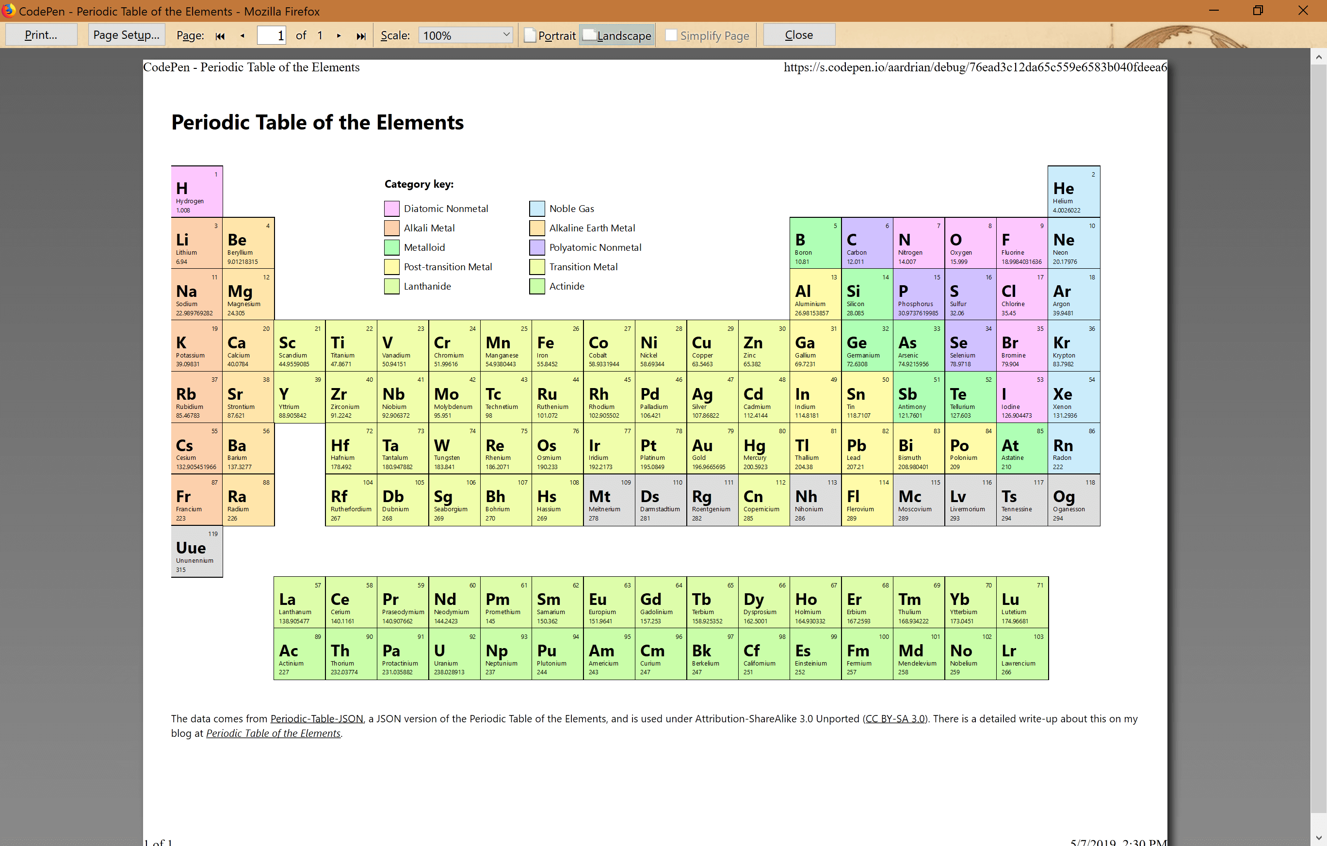
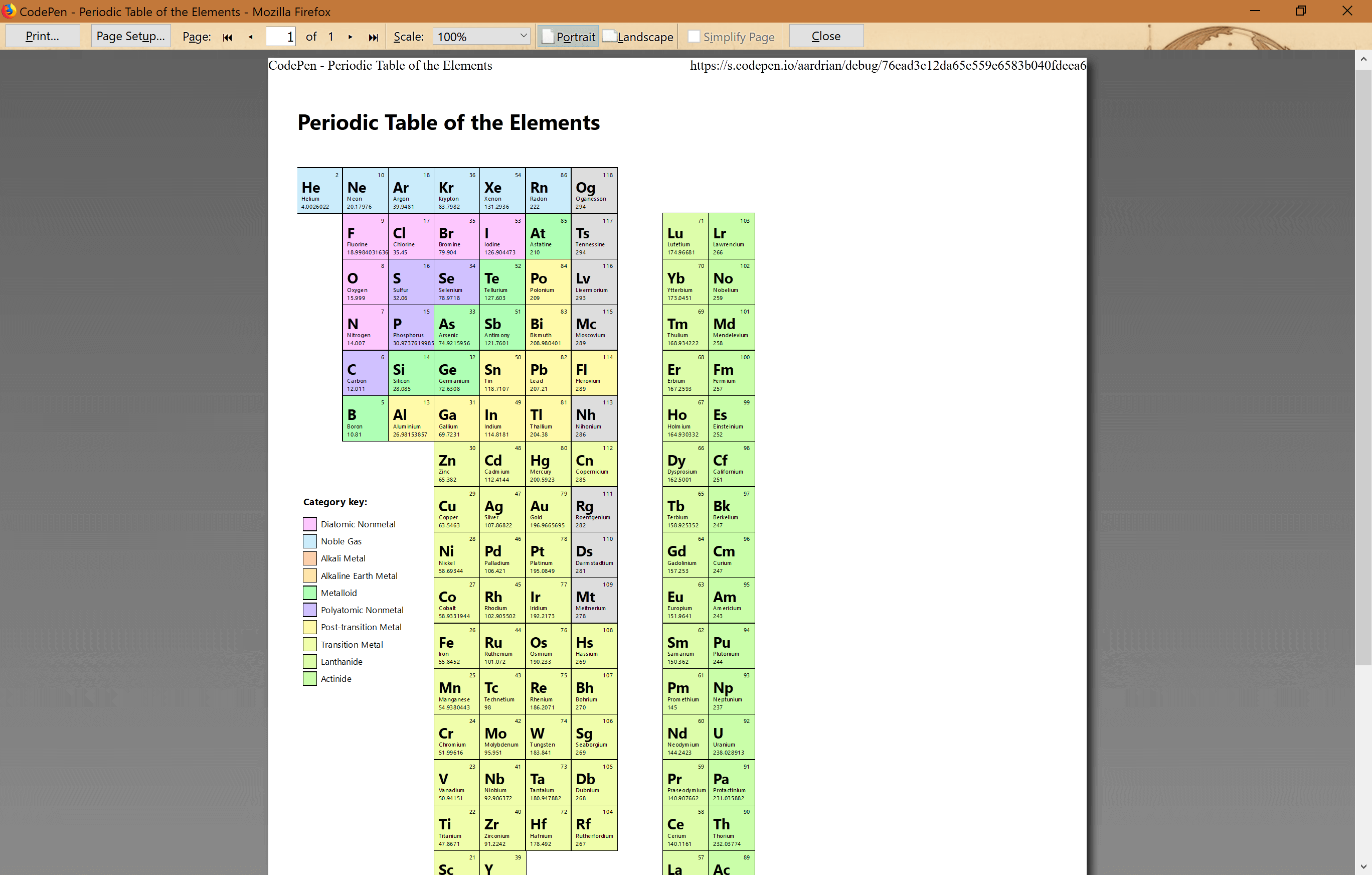
There is no reason that you cannot print this. No reason other than browser wonkiness.
I want my sideways view to print when the paper is portrait, taking up as much space as possible. I do that by messing with the font size to get what I want to trigger the 40em media query.
@media print {
  #Elements ol {
    font-size: .7vw;
  }
}
For the wider view in landscape, same concept but with an adjusted media query.
@media print and (orientation: landscape) {
  #Elements ol {
    font-size: .63vw;
  }
}
Sadly, I can only get this work consistently in Firefox.
Interaction
The advantage of a web-based Periodic Table of the Elements is that you can do more than just show static text. With all the data coming from the JSON file I have some options, though all the stuff most valuable to scientists is probably meaningless to me.
Zooming Elements
There is a reasonable chance that the text will be too small to read in the default layouts. I started to work out a way to get around it by zooming into a box when hovering over it or putting focus in it. Maybe not an ideal solution, but I rather liked how it made the relevant element pop for me.
While a hover style would be enough for just a mouse it also must support keyboard. I wanted to avoid a lot of unnecessary JavaScript handlers and, owing to an audience of just me, opted for a CSS solution in :focus-within. Note the styles in :focus-within are redundant owing both to lack of browser support and that their presence with hover styles will break them completely in non-supporting browsers.
I also only trigger this behavior when I have scaled the text down, which means once I start to lay out the table.
@media all and (min-width: 40em) {
  #Elements li:not(#Key):hover {
    transform: scale(2);
    z-index: 120;
    box-shadow: 0 0 1em rgba(0,0,0,.8);
  }
  /* Merge with above when :focus-within is supported */
  #Elements li:not(#Key):focus-within {
    transform: scale(2);
    z-index: 120;
    box-shadow: 0 0 1em rgba(0,0,0,.8);
  }
}
I am excluding any list items that have id="Key". I do not want the category key to ever scale.
For items on the outside columns, I scale them from the edge instead of the center to prevent window clipping and horizontal scrollbars. I found it easier to put an upper bound on the media query triggering it than to reset the transform-origin in the wider viewport, but that was mostly my mood at the time.
@media all and (min-width: 40em) and (max-width: 60em) {
  #Elements li.row1:hover {
    transform-origin: left;
  }
  #Elements li.row10:hover {
    transform-origin: right;
  }
  #Elements li.row1:focus-within {
    transform-origin: left;
  }
  #Elements li.row10:focus-within {
    transform-origin: right;
  }
}
@media all and (min-width: 60em) {
  #Elements li.col1:hover {
    transform-origin: left;
  }
  #Elements li.col18:hover {
    transform-origin: right;
  }
  /* Merge with above when :focus-within is supported */
  #Elements li.col1:focus-within {
    transform-origin: left;
  }
  #Elements li.col18:focus-within {
    transform-origin: right;
  }
}
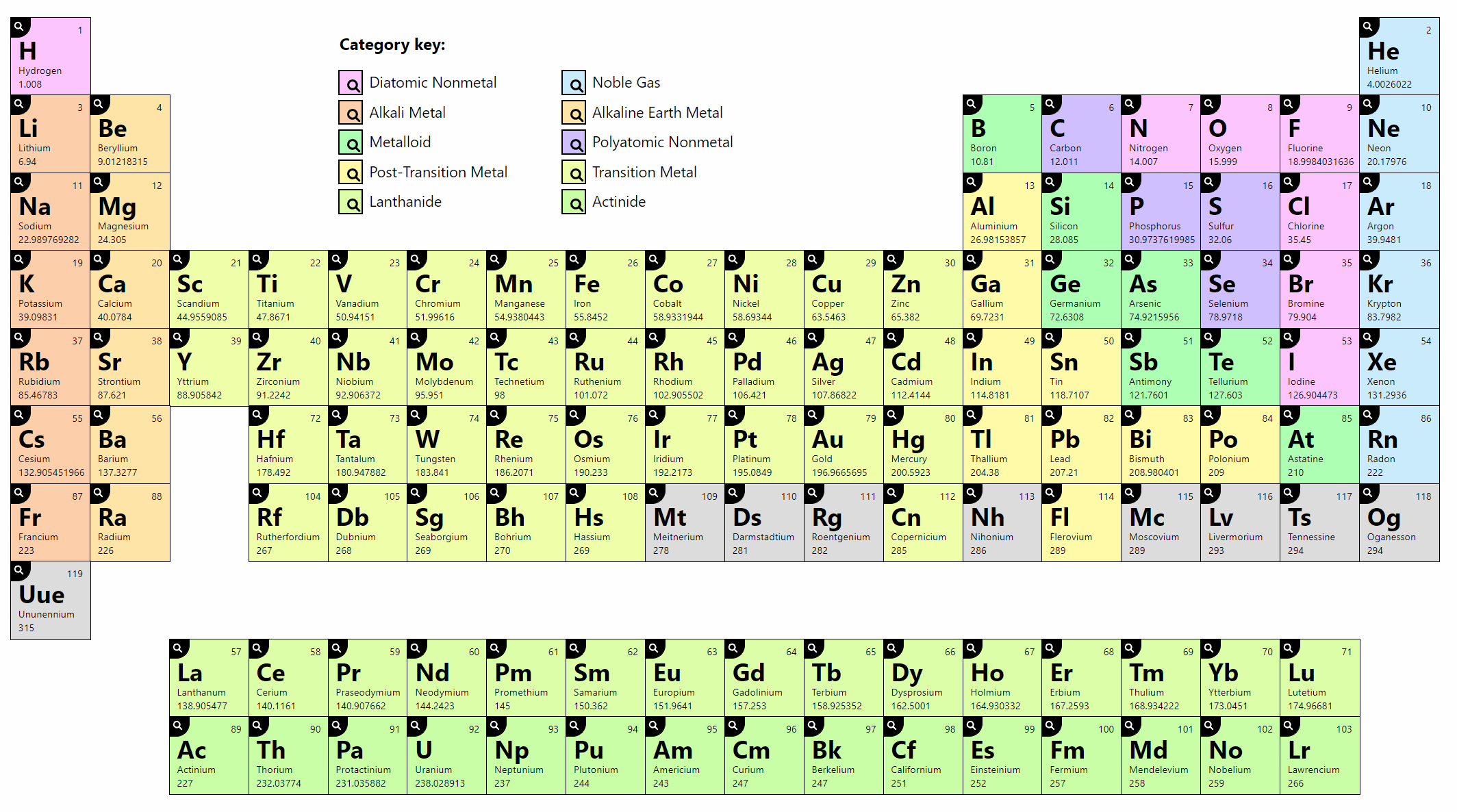
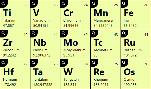
Highlight Categories
You may have noticed that the atomic elements are color coded and that there is a key to help identify what each color means. I get the category text from the JSON, convert each to unbroken strings, and append them as classes to each atomic element’s list item.
      // Get the category and concatenate into the class
      var rawCat = json.category;
      var stringCat = rawCat;
      stringCat = stringCat.split(' ').join('_');
      stringCat = stringCat.split(',').join('');
      elementNode.classList.add("cat-" + stringCat);
<li id="Mo" class="row5 col6 cat-transition_metal">
 […]
</li>
It is important to know that while the key appears visually in the gap at the top of the Periodic Table, it lives as the last list item of the overall collection. If I had put it first, then each atomic element would have a list position one off from its atomic number.
It also means the tab order may be different than a user expects, though for screen reader users I attempt to mitigate that by making the text “Category key” an <h2> to make it easier to jump right to the key. If you wonder why a screen reader user would care about seeing this, remember that not all screen reader users are blind.
The catch in my design is that it may not be easy to tell the category colors apart. I address that by allowing the user to hover (or tab to) each item in the key. For Molybdenum, the button looks like this:
<button type="button" onmouseover="ToggleStyleBlock('cat-transition_metal','show');" onfocus="ToggleStyleBlock('cat-transition_metal','show');" onmouseout="ToggleStyleBlock('','hide');" onblur="ToggleStyleBlock('','hide');" id="btn-cat-transition_metal" aria-labelledby=" btn-cat-transition_metal cat-transition_metal">highlighting</button>
The ToggleStyleBlock() function simply writes (or removes) CSS rules that make all list items that are not the same category essentially lose their background.
      styleBlock.sheet.insertRule(
        "#Elements li:not(#Key):not(." + strClass + ") { background-color: #999; opacity: .5; }",0
      );
      styleBlock.sheet.insertRule(
        "@media screen and (prefers-color-scheme: dark) { #Elements li:not(#Key):not(." + strClass + ") { background-color: #333; opacity: .5; } }",1
      );
      styleBlock.sheet.insertRule(
        "@media screen and (-ms-high-contrast: active) { #Elements li:not(#Key):not(." + strClass + ") { opacity: .25; } }",2
      );
You may notice that two of those rules use feature queries, specifically the proprietary -ms-high-contrast for Windows High Contrast Mode, and the now standard prefers-color-scheme for users running a dark theme.
Dialog
The dialog is a bit of a mess. That is mostly owing to the poor support across browsers for how to properly restrict focus to a dialog without breaking the browser and partially owing to it not being the thing I wanted to play with here.
Right now, support for native <dialog> is poor, and the polyfill (which I am not linking) does not help where it really matters most — assistive technology. Scott O’Hara details the problems in his post Having an open dialog. Instead I built a custom dialog generally based on these tips from Scott O’Hara with the inert polyfill to make it at less awful.
After all that, the dialog still has some gotchas for tall screens, and some screen reader and browser combinations. The problem here is that for an audience of just me it works fine as you see it. Mostly. Either way, do not copy it. Yet.
I do address the critical items, however. The dialog’s close button receives focus when it opens so I can hit Enter immediately to dismiss it (focusing the modal itself can also be fine). It also goes away with a press of Esc or a click outside the modal. My script is not, shall we say, perfect, but it does the job.
As for the layout in the modal, well, I simply got tired of working on it. I may update the layout in the future. After all, I already know I may come back and tweak the modal over time. You may notice that the <dl> splits into two columns, but sometimes splits between a <dt> and its following <dd>. So yeah, work to be done there.
Accessibility
I have made decisions throughout to address accessibility. I have been careful about the HTML elements I have used. I have considered the reading and tab order. I have ensured that interactive controls are native. I have accounted for user preferences on text size. I have probably made other decisions that are reflex that I did not even consider. All of these are integrated into the initial build. Here I will touch on some specific decisions I made that make the experience better for everyone.
Contrast
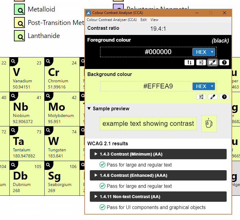
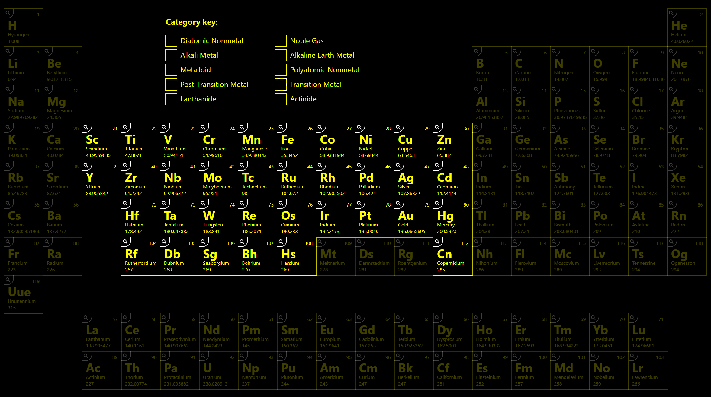
For the contrast, I ensured that the background color for each category type had at least a 4.5:1 contrast ratio with the text — though as you can see in the screen shot I was really at about 19:1 contrast ratio.
The rest of the contrast was easy. White magnifying glass icon on a black background, reversed on focus/hover? Easy. While I did not make that color decision for accessibility reasons, it certainly proved easier.
Names
For each of the buttons I use aria-labelledby and point to both the text in the button, which is visually hidden, and the element (or category) name. I lean on this over aria-label because machine translation services such as Google Translate will not translate aria-label.
<li id="Mo" class="row5 col6 cat-transition_metal">
 <div>42</div>
 <div>Mo</div>
 <div id="nameMo">Molybdenum</div>
 <div>95.951</div>
 <button type="button" id="btnMo" aria-labelledby="nameMo btnMo" […]>details.</button>
</li>
<dt class="cat-transition_metal">
 <button type="button" […] id="btn-cat-transition_metal" aria-labelledby="btn-cat-transition_metal cat-transition_metal">highlighting</button>
</dt>
<dd id="cat-transition_metal">transition metal</dd>
Molybdenum details. Button.
Highlighting transition metal button.
Reduced Motion
There are two cases of things on the screen flying at the user — the individual atomic elements and the modal. Because these animations are CSS, I can use a prefers-reduced-motion feature query to disable them.
#Elements li {
  transition: transform .05s ease-in-out,
           box-shadow .2s ease-in-out,
           background-color .2s ease-in-out;
}
[role="dialog"] {
  transition: transform .1s ease-in, opacity .2s ease-in;
}
@media screen and (prefers-reduced-motion: reduce) {
  #Elements li, [role="dialog"] {
    transition: none;
  }
}
Dark Mode
Often I will just invert the entire page with CSS for a dark mode, but I did not care for the colors it produced for each of the categories. So I took some time to find darker versions of each category color that still maintained a minimum 4.5:1 contrast ratio (but still actually closer to 19:1) with the white text.
I stuffed all that in a prefers-color-scheme: dark feature query, along with overall page color changes, and was off to the races. To me it looks like an Easter night scene.
.cat-transition_metal {
  background-color: #F0FEAB;
}
@media screen and (prefers-color-scheme: dark) {
  .cat-transition_metal {
    background-color: #676C4A;
  }
}
Windows High Contrast Mode
Windows High Contrast Mode (WHCM) is a feature that only comes in Windows. It essentially dumps most colors and uses a handful of system colors instead, overriding many of your styles. I have written about WHCM a few times here.
Mostly I add an outline to the buttons and reset the background color, leaning on the keyword windowText. I also swap the SVG for users who have gone to a dark high contrast theme.
Since I am already changing opacity for atomic elements when I am exploring categories, this carries over to WHCM with no changes needed.
@media screen and (-ms-high-contrast: active) {
  #Elements li button:focus, #Elements li button:hover {
    outline: 1px windowText dotted;
    background-color: windowText;
  }
}
@media screen and (-ms-high-contrast: white-on-black) {
  #Elements li button {
    background-image: url("data:image/svg+xml;charset=utf8,%3Csvg xmlns='http://www.w3.org/2000/svg' viewBox='0 0 100 100'%3E%3Cpath d='M71.77069 61.87311a36.53064 36.53064 0 1 0-9.89917 9.89868l21.1792 21.17792a6.9996 6.9996 0 1 0 9.89844-9.89942zM41.49994 64a22.5 22.5 0 1 1 22.5-22.5 22.52554 22.52554 0 0 1-22.5 22.5z' fill='%23fff'/%3E%3C/svg%3E");
  }
  #Elements li button:focus, #Elements li button:hover {
    background-image: url("data:image/svg+xml;charset=utf8,%3Csvg xmlns='http://www.w3.org/2000/svg' viewBox='0 0 100 100'%3E%3Cpath d='M71.77069 61.87311a36.53064 36.53064 0 1 0-9.89917 9.89868l21.1792 21.17792a6.9996 6.9996 0 1 0 9.89844-9.89942zM41.49994 64a22.5 22.5 0 1 1 22.5-22.5 22.52554 22.52554 0 0 1-22.5 22.5z' fill='%23000'/%3E%3C/svg%3E");
  }
  [role="dialog"] button, [role="dialog"] button:focus, [role="dialog"] button:hover {
  background-image: url("data:image/svg+xml;charset=utf8,%3Csvg xmlns='http://www.w3.org/2000/svg' viewBox='0 0 100 100'%3E%3Cpath d='M50 0a50 50 0 1 0 0 100A50 50 0 0 0 50 0zm26.6 76.6a37.5 37.5 0 0 1-53.2 0 37.5 37.5 0 0 1 0-53.2 37.5 37.5 0 0 1 53.2 0 37.5 37.5 0 0 1 0 53.2zm-7.3-45.9a6.6 6.6 0 0 0-9.3 0l-10 10-10-10a6.6 6.6 0 0 0-9.3 9.3l10 10-10 10a6.6 6.6 0 1 0 9.3 9.3l10-10 10 10a6.6 6.6 0 0 0 9.3 0 6.6 6.6 0 0 0 0-9.3l-10-10 10-10a6.6 6.6 0 0 0 0-9.3z' fill='%23fff'/%3E%3C/svg%3E");
  }
}
Yes, I am spending a lot of space on managing SVGs whose only difference is their fill color. My decision to lean on plain text within each button instead of an SVG is how I painted myself into this non-DRY corner.
WHCM Update: January 19, 2020
The new Chromium-based Edge (ChromiEdge) does not honor WHCM quite the same as in legacy Edge nor Internet Explorer 11, for which I have filed issues, so you will need to test your styles now and when this gets sorted.
Wrap-up
There is a lot going on in my demo. JSON parsing, grid layout, responsive design, accessible name calculation, interactions, effing modals, and so on. Many of these can probably be made more efficient and any of these probably misses a use case or edge case.
By putting this out here I am opening it up for criticism from those who deeply know an aspect, for learning from those new to these things, and for free bug checking from everyone else. We do not have peer review in our industry, but blogging your experiments and ideas is about as close as we can get.
If you have good ideas for how to visualize the science data I show in the modals, please share something I can steal.
Update: 22 May 2019
While at YGLF I discovered that a couple days prior to posting this Chen Hui Jing had made her own periodic table grid experiment — but with HTML elements instead of chemical elements.
Similar but different. It is worth comparing the two approaches just to see the variety of techniques.
Update: 28 May 2019
Apparently there may be a better way in the middle width media query to display the elements instead of a rotated table.
This is really cool. Love the grid use. Unsolicited chemistry feedback: instead of rotating it sideways, dropping the d-block down below (like the f-block is) is preferable. For me, rotating the p-table is like rotating my keyboard and still trying to type on it. :)
No, I think it would still be ok to rotate the f-block, or maybe even separate the Lanthanide & Actinide rows and let them wrap? The f-block is lesser-used, and the periodic trends are not as memorable imo.
So I gave it a go:
See the Pen Periodic Table of the Elements — Modified Middle View by Adrian Roselli (@aardrian) on CodePen.
16 Comments
I’m loving it. Thank you.
In response to . I do not accept your challenge. Probably.
But I am curious if those hexagons are intended to look like octohedrons as an isometric projection. Even then, though, CSS has no
z1-index(that I know of).
In response to . I checked with the theorist. The actual stacking shape is a rhombic dodecahedron but he needed dead space for his physical model, and so reduced them to octahedrons and joined them by vertices instead of faces. Apparently the planes (or vertices in this case) represent the 3 dimensions minus time. He is a string theorist, so to him time/space is (3+1)*3=12 and removing time leaves 6 pointing in both directions (?)
In response to . I forgot the most important thing.
He said that most string theorist will tell you that there are 11 dimensions plus time and don’t even talk to him if you follow that reasoning.
In response to . I just went over my notes. I think he said edges, not vertices. That looks about right, I think.
In response to . My head hurts.
Where did you get your database from?
In response to . As I noted above, the data comes from Periodic-Table-JSON.
Why the elements are arranged like to this?
In response to . Gauri, if you mean the visual display at the widest viewport, I am copying the periodic table itself. At the narrower viewports I am trying to retain some of the correlations provided in the wider layout and I do my best to explain in the post.
Otherwise, they are arranged in my code in ascending order of their atomic number.
The source periodic table uses columns to group elements with similar chemical behaviors. The row breaks generally flow from metals at the row start to non-metals at the row end. You can read more about this visualization at Wikipedia.
Hi! Apparently CollegeBoard is using this period table in the 2021 AP testing app, and their derived version is also shared under CC BY-SA 3.0.
In response to . Ok, that’s pretty cool. If you can ever get a screen shot I would love to see it in context!
Hi Adrian, I’m looking to use this for learning resources on the open web. What attribution would you prefer?
In response to . FYI, I am building on your Codepen code, not iframing or linking to directly
In response to . Jack, thanks for asking. I would be thrilled with my name and a link back here.
Your question also prompted me to update the post to include the license, which is Creative Commons Attribution-ShareAlike 4.0 International (CC BY-SA 4.0) for anyone else who might be interested in using this. I am aware of at least one high school study guide embedding it.
Leave a Comment or Response